
Landing pages are the digital storefront of modern business. In years of software engineering, I have witnessed how a well-designed landing experience can rapidly shift the course of a SaaS launch, a consultancy pitch, or a digital product release. With so much riding on those first seconds of user attention, the path from idea to high-converting landing environment deserves careful attention.
In this detailed guide, I will walk you through every step of the landing page creation process, from clarifying goals to measuring real-world results. My aim is simple: show you not just how landing pages are built, but why my approach as Adriano Junior—an experienced freelance software engineer and technical consultant—delivers standout results for people who want to transform curious visitors into loyal clients.
Why landing pages matter for modern businesses
Landing environments serve one purpose: to turn interest into action. Whether that action is signing up, booking a call, downloading an e-book, or another goal, every design decision must support it. In my experience, landing interfaces compress business value into a microsite focused on trust, clarity, and activation.
First impressions online aren’t just quick; they’re make-or-break.
For SaaS founders, consultants, and digital product teams, the right landing experience helps with:
- Testing new ideas quickly and collecting data before a full launch
- Focusing a marketing campaign on a specific service, offer, or persona
- Improving conversion rates compared to generic or distracted web pages
- Building credibility and trust with concise testimonials and expert signals
- Providing a clear, distraction-free pathway to becoming a customer
I’ve worked with fast-growing SaaS businesses and solo consultants alike. Across every project, one truth holds: if you do not invest in the right landing experience, you pay with lost conversions and wasted effort.
The foundation: defining your landing page’s objectives
Before even sketching a layout, I insist that every client specify a single, precise objective for their new landing presence. This focus helps us avoid two common traps: muddled messaging and weak calls to action.
Getting specific with your goal
A landing environment can support only one main action well. That might sound strict, but as best practices for effective landing pages show, clarity is powerful. Here are typical objectives I help clients clarify:
- Lead capture (e.g., newsletter signup, demo booking, trial registration)
- Direct sales (purchasing a product or digital download)
- Event registration (webinar, launch event, or workshop)
- Consultation requests (for coaching, auditing, or large projects)
- App downloads (for SaaS, mobile, or desktop tools)
Every proven landing workflow begins by anchoring layout, copy, and visual cues to the action that matters most to your business. In consulting sessions, I always advise clients to avoid “multi-headed” landing experiences where users feel uncertain about what to do next.
Defining metrics for success
Once the core action is set, it’s time to specify what “success” looks like. Below are examples I monitor with clients:
- Conversion rate (actions completed divided by visits)
- Bounce rate (the percentage who leave without engagement)
- Average time on page (context for how engaging the content is)
- Click-through rate on the main CTA button
- Quality of leads generated (if relevant)
In my own work, this level of clarity helps us design experiments, compare variations, and avoid vanity metrics.
Mapping the user journey: anticipating your visitor’s mindset
Having built hundreds of landing experiences, I find that stepping into your visitor’s mind separates “pretty pages” from high-converting ones. My method involves four phases:
- Understanding the traffic source. Are visitors arriving from your email sequence, a paid ad, or social campaigns? Each source brings a different intent, which should inform both the language and CTA placement.
- Sketching the first-impression sequence. What does a new user see, feel, and learn in the first five seconds? Does the headline answer the question “Why should I stay?”
- Anticipating objections. Which doubts or worries might hold back conversion? Address them with FAQs, risk reversal (e.g., money-back guarantees), or customer stories.
- Designing a no-brainer action step. By the page’s completion, can the user take clear next steps with zero confusion?
A powerful tip I use often: for each major section, ask yourself, “Does this move the visitor one step closer to our goal, or is it a distraction?”
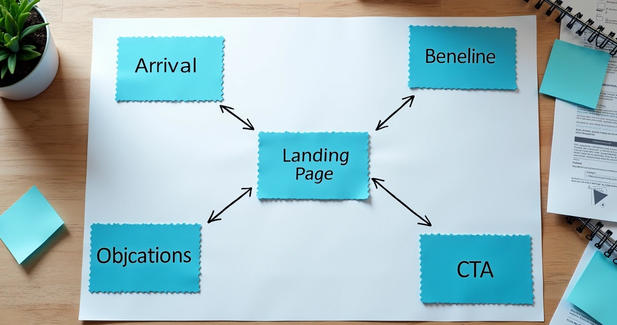
Layout decisions: building a conversion-focused structure
The structure of a landing environment is not art-first. It is about channeling attention, removing friction, and nudging the user into action. Whether I am building for SaaS, a consulting offer, or a digital download, my preferred structure follows a proven pattern:
- Hero section above the fold with a headline, supporting subheader, key visual, and single primary CTA.
- Benefit statement or value proposition using short bullet points or concise paragraphs that address key user pain points.
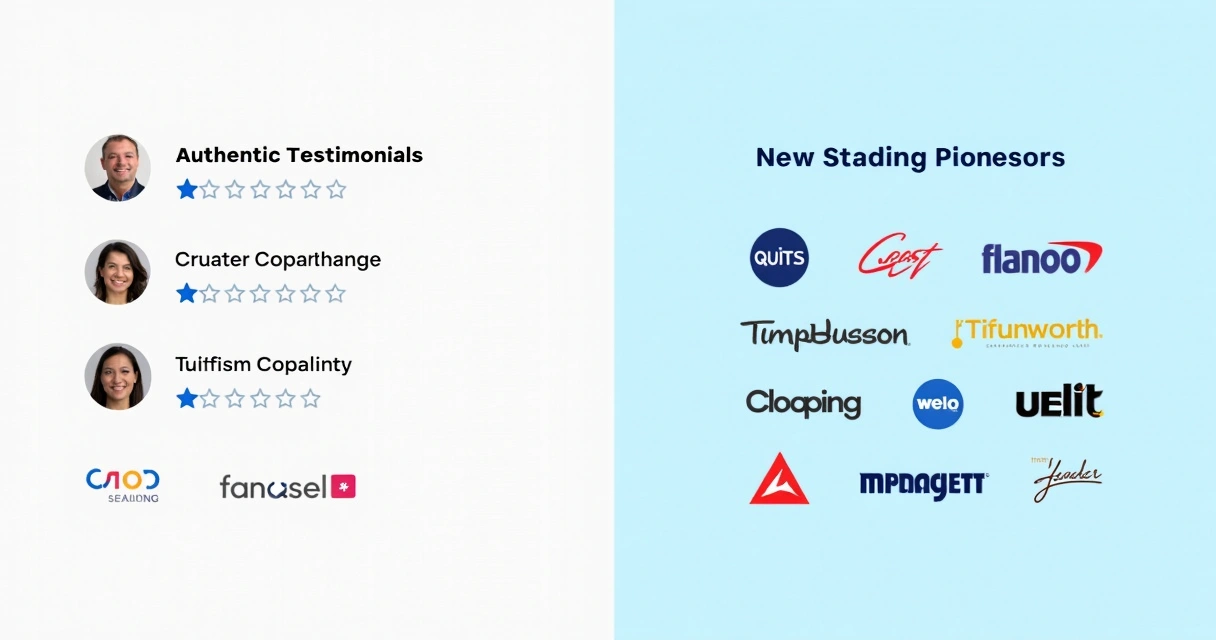
- Social proof section with testimonials, client logos, or review indicators supporting trust and expertise.
- Feature summary (for products or SaaS), or service highlights (for consulting), often with supporting icons or imagery.
- Objection handling using an FAQ, guarantee badge, or a brief story of successful transformation.
- Final CTA, sometimes paired with a short closing statement to reinforce urgency, value, or simplicity.
In my experience, more elements rarely help conversion. If a section is not serving a direct purpose, I remove or condense it.

Visual hierarchy and attention flow
Visual weight, contrast, and spacing matter for convincing users to scroll and act. Key best practices I use include:
- Ample whitespace to separate sections and avoid information overload
- Bold, high-contrast headlines above sections to anchor skimming eyes
- Primary call-to-action button always more visually prominent than secondary links
- Consistent color themes to avoid confusion or brand dilution
- Directional cues (arrows, photos of people “looking” at the CTA, or design angles pointing toward action areas)
These small details, when applied consistently, support the user’s journey and encourage higher conversion.
Copywriting for clarity and persuasion
In my consulting projects as Adriano Junior, I have seen poorly written copy damage even the most beautiful landing visuals. I believe that words are the bridge between curiosity and conversion. Your landing copy must promise value, signal trust, and demand action—without fluff.
Headline writing that grabs and holds attention
I start every project by drafting 5–10 headlines and testing them with users or colleagues for instant feedback. The headline must:
- State a key benefit or “pain reliever” in under sixteen words
- Speak directly to the user’s biggest problem or desire
- Use clear, simple language—avoid jargon and overused phrases
If your headline could apply to any competitor, write a better one.
Structuring benefits and features
While features build credibility, benefits convert. I use the following approach for structure:
- Begin with a value statement: what does your solution help the visitor achieve?
- List three to five benefits (not features) in bullets
- Support with metrics or details if possible (“Save three hours per week,” “95% satisfaction rate”)
- Connect features with the real business or personal impact

Tackling objections and building trust
In fast-growing SaaS and consulting spaces, skepticism runs high. To pre-empt doubt, I add:
- Testimonials with authentic details (first names, company, clear results)
- Visible trust badges (certifications, security seals, press mentions, or client logos)
- Short FAQ addressing pricing, results, refund, or security concerns
- “Risk-free” offers (money-back guarantee, free trial, demo with no credit card required)
Strong copy here gives peace of mind and reduces hesitancy.
The call to action: clarity over cleverness
When I test conversion-focused landing environments, the same principle emerges: users should know what happens when they click the CTA button, and why it matters for them. I recommend:
- Simple button text like “Start Free Trial,” “Book My Demo,” or “Download Now”
- One main CTA per page, always above the fold, and repeated at logical breaks
- Tight on-page copy near the CTA to set expectations (“Takes 2 minutes. We don’t spam.”)
As studies from the University of San Francisco emphasize, limiting outbound links and making your CTA visually unmissable is key.
Visual elements: inspiring trust and delight
Effective landing pages meet visitor expectations for visual quality. But I see lots of digital businesses get tripped up: stock photos, pixelated icons, or mismatched branding cheapen the impression. So I use these principles:
- Hero images should reinforce—not distract—from your message. For SaaS or AI-driven tools, custom illustrations showing happy users, dashboards, or workflow overviews work well.
- Logos and trust markers need to look crisp at every screen size. Place them near the top if possible.
- Illustrations or screenshots should focus on key functionality, not every minor option. Less is more for scannability.
- Icons must align with the brand language and be easy to understand, even at a glance.
- Testimonial photos (where appropriate) humanize your offer and are often far more persuasive than text alone.
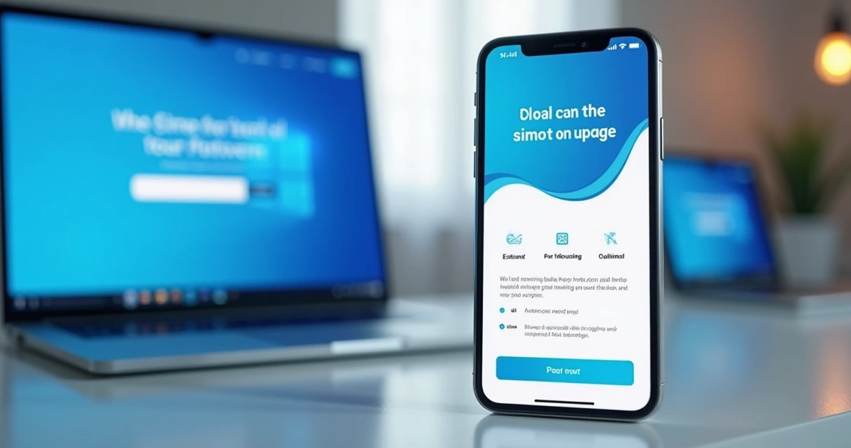
Mobile and fast—responsive design for every device
In research and direct analytics from client projects, I consistently see mobile traffic account for half or more of all visitors. If your landing presence is not sleek, crisp, and quick on a phone, you are losing conversions every day.
Key practices I enforce in every build:
- Text is large, readable, and reflows naturally on any device
- CTAs, forms, and navigation elements are easily tappable
- Visual assets load responsively, never slowing first paint
- Layout avoids “pinch and zoom” situations or broken stacking
- Background images, videos, or animation effects do not block usability on lower-end phones
If you want to dig deeper into multi-device approaches, my article on responsive web design for modern apps contains more best practices and sample scenarios.
Performance: fast enough to keep conversions high
Attention span is short, and slow-loading landing environments destroy results. Google’s research finds that a page load time over three seconds causes about half of users to drop off before ever interacting.
- I use optimized image formats (WebP or SVG for most illustrations and icons)
- Minimal extra JavaScript—no unnecessary plugins or trackers
- Smart font selection for speed and clarity
- Clean CSS, avoiding deep nesting or heavy frameworks unless truly needed
All sites I build as Adriano Junior include a multi-device performance audit before launch.
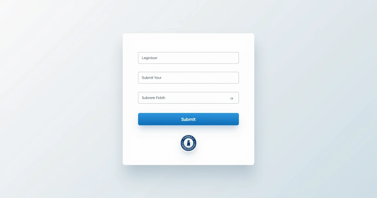
Forms and data capture: removing friction
For most B2B and consulting landing environments, the form is the “money spot”: your chance to collect a lead with the lowest possible resistance.
I focus form design on three ideas: fewer fields, maximum clarity, and reduced anxiety about next steps.
- Only ask for what you truly need (often just email and first name for starters)
- Use a clear visual border and label each field—no guessing what is required
- Add a privacy reassurance (“We don’t share your info” or a trust badge near the submit button)
- Single-column layout so users can scan without confusion
- Immediate feedback for errors (real-time validation if possible)
- Always show what will happen after submitting (confirmation message or redirect)
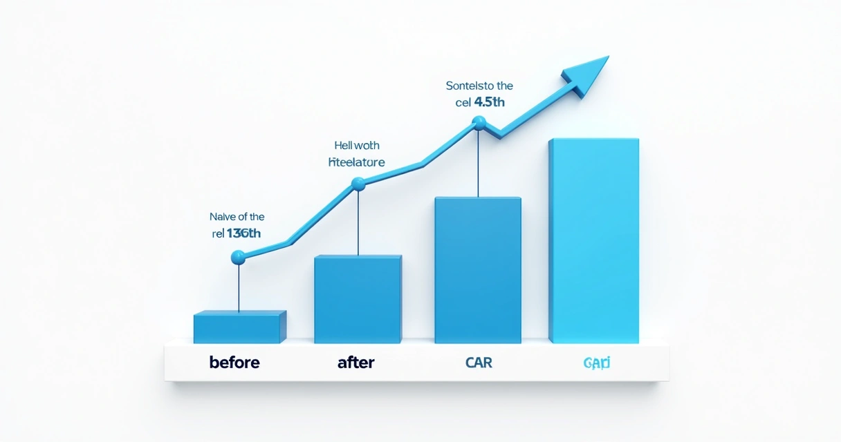
A/B testing: fine-tuning your approach
In my extensive freelance work, I always stress this truth: guesswork is not optimization. Even highly experienced designers can misjudge what headline, CTA, or color scheme will convert best for a given offer.
A/B testing (also called split testing) removes uncertainty by letting actual users show what works:
- Create two (or more) variants—change just one thing at a time (headline, button color, email vs. phone form, etc.)
- Send enough traffic to each version to collect meaningful data—no fewer than 200 visits per version if possible
- Track key metrics: conversion rate, time on page, and sometimes engagement with individual sections
- Pick the winner, then try a new variable (“always be testing” breeds steady improvements)
I set up A/B frameworks with clients using landing-focused platforms or code-level solutions—whatever fits budget and stack.
What to test first?
- Headline and supporting sub-header (these carry the most conversion weight)
- Main CTA button label and color
- Placement of social proof (test above vs. below main benefits)
- Form length and submission process
- Order of sections (sometimes reversing benefits and feature breakdown does wonders)
Remember to test one variable per experiment for clear results.
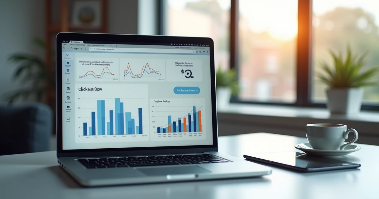
Tracking and analytics: measuring what matters
Effective digital marketing is not guesswork. In every client engagement, I set up analytics from first publication. It’s critical to match your analytic depth to your goals:
- Google Analytics (or a privacy-focused alternative) for broad engagement and conversion tracking
- Session replay tools (e.g., LogRocket, FullStory) to see how real users interact with your content
- Heatmaps for click and scroll tracking (understanding where attention is lost)
- Form analytics for drop-off rates and common mistakes
The best part of a structured analytics setup is the feedback loop: you see which elements attract action, and which repel it. If you want to go even deeper, studying behavioral flows and quality scores can help you spot hidden friction fast.
Iterating layouts and content: learning from real data
No matter how “perfect” a landing environment feels on launch day, continued improvement is the difference between average results and true business growth. My process looks like this:
- Review analytics weekly for at least 30 days post-launch. Watch for conversion rates, unusual bounce spots, and places where mobile/desktop diverge.
- Interview real users where possible. A handful of five-minute phone calls or on-page feedback widgets yield more insight than dozens of analytic charts.
- Refresh copy, visuals, or order of sections based on feedback. Even a single revised headline or repositioned testimonial often bumps results.
- Test new value propositions or offers if initial results fall short. Sometimes a free call, audit, or downloadable guide creates momentum where “book a demo” did not.
- Document lessons learned for future campaigns. Building a knowledge base saves time and boosts performance for the next landing experience.
Because I work directly with ambitious business owners, I see firsthand how this cycle turns uncertainty into steady conversion lifts.
AI integration and future-ready landing experiences
One way I differentiate my services from most other freelancers is by weaving in AI-powered personalization and dynamic content adaption. For modern SaaS, productized consulting, or digital product launches, this offers measurable improvements:
- Dynamically adjusted headlines or testimonials based on detected user segment
- Real-time chatbots or AI-driven FAQ widgets for instant question resolution
- Recommendation engines for upsells or related offers (especially effective for multi-product businesses)
- Micro-personalization: offering use-case-specific images, case studies, or calls to action based on traffic source
If these advanced techniques interest you, see my deeper coverage on modern website design trends and AI personalization—a great resource, no matter your project stage.
Value-first UX: eliminating distractions and roadblocks
Strong business results come from design that respects users’ time and attention. I eliminate or reduce:
- Top navigation menus (unless minimal, with logo only)
- Outbound links and unnecessary footers—these dilute focus and may leak conversions, as highlighted by research on best landing page structure
- Auto-playing videos or background sounds (a top reason for instant page exits)
- Excessive pop-ups or aggressive overlays before the main offer is clear
- Low-value content blocks (“Our Mission,” “About Us,” generic paragraphs that do not build trust or credibility)
In all projects, I ask clients to be ruthless in evaluating every section: “Does this help my prospect become a customer, or get in their way?” Only those sections that pass this filter make the cut.
Bringing it all together: two real-world examples
Case study one: SaaS time tracker launch
A B2B SaaS founder requested a high-conversion launch page for a new time-tracking tool. My process:
- Clarified the sole goal (“Start Free Trial” with email capture)
- Positioned a bold headline targeting managers worried about project slippage
- Placed testimonials about improved team transparency directly below main benefit list
- Single-column non-crowded form, visible above the fold on all devices
- Trust badges (“Data Secure,” “GDPR Compliant”) right next to the CTA
- Launched with A/B tests: long vs. short benefit sections, two headline options
- Result: 5.2% conversion rate within a week—beating previous launches by 60%
Case study two: consulting audit service page
A consultant needed a fast-turnaround lead capture environment for their digital transformation audit. My approach:
- Used a headline promising measurable improvements in cost savings and process speed
- Lean trust section: four testimonials, each featuring less than one sentence (“Tripled our ROI in 90 days”)
- Feature block addressed most common CEO concerns (integration, support, reporting)
- Short FAQ tackled objection around pricing and confidentiality
- Conversion form with name, company size, and business email—nothing else
- Mobile performance: sub-second speed load, thanks to optimized images and no outside libraries
- A/B tested “Book Free Audit” versus “Request Your Assessment”—the first outperformed by 2.8X
Both projects moved from idea to conversion-driven launch within two weeks, and both reinforced a belief I hold:
Clear messaging, crisp visuals, and relentless testing outclass expensive design alone.
Bridging landing design with broader business growth
In conversations with SaaS founders, digital agencies, and freelance consultants, I hear a recurring theme: “How do I connect this landing experience with the rest of my web presence or product journey?” My answer:
- Landing environments are micro-sites with one focus—they’re not replacements for product pages, homepages, or resource hubs
- Linking out should be deliberate (e.g., “See all plans,” “Book a call,” “View features” only after a fail decision on the main CTA)
- Design and tone must match your brand across channels for seamless credibility and trust
- Landing insights often inform website redesigns—I wrote on this topic in my guide on website redesign strategies for modern growth
Landing experiments often reveal new audience segments, high-converting messaging, or objections you hadn’t anticipated—fueling smarter growth far beyond a single campaign.
Choosing the right technology stack for landing development
Here is where my own background as a full-stack engineer, AI developer, and devops partner pays off for clients. The ideal stack depends on goals, scale, and integration needs, but my favored options include:
- For fast prototyping and “minimum viable” launches: Static site generators (like Gatsby, Next.js, Hugo). Webflow or Framer for visual, code-light launches where high fidelity and fast iteration matter.
- For deeper integration with SaaS, analytics, or subscription backends: React or Vue SPA frameworks, often with serverless logic (AWS Lambda, Netlify Functions) for form handling. These allow custom business logic, dynamic personalization, and A/B testing pipelines.
- For businesses wanting long-term scalability or custom workflows: Custom stacks (Laravel or Symfony for PHP, Express for Node.js) with tightly coupled database and CMS. REST or GraphQL APIs to support future product growth.
- Design frameworks: Tailwind CSS for speed and utility, Figma for collaborative design, and Storybook for reusable component libraries.
Every solution I recommend is chosen to match your growth plan. I don’t force clients into a single platform; I architect landing experiences that are fast to launch and easy to evolve. For smaller teams with extra focus on cost-effective design, I’ve described great approaches in my analysis of affordable website design for smaller businesses.
How Adriano Junior stands apart: value, experience, and outcomes
Many landing offerings—agency or freelancer alike—fall short on one or more critical factors: speed, trust, customization, or the ability to iterate with data. Here is why I consistently deliver better results for clients like you:
- 16+ years of building not just “designs,” but scalable applications, integrated analytics, and AI/automation components
- Direct experience with hundreds of A/B and multivariate tests—no guesswork, just results
- Transparently priced engagements: no vague fees, no “per click” or “per impression” surprises
- Rapid communication, real ownership—from first call to launch and beyond
- Proven expertise across B2B, SaaS, consultancy, and productized offers
- Modern stack, best-in-web security, and a focus on user privacy at every step
Most competitors build pretty pages; I build landing systems engineered for sales, lead generation, and sustainable growth. I am not seeing many other freelancers combine full-stack skill with business strategy, analytics, and AI-powered enhancements under one roof.
Common mistakes and how I help clients avoid them
- Too many distractions: If anything pulls attention off your CTA, conversion will drop. My method: single-goal structure, limited menus, and sensible whitespace.
- Unclear copy or jargon: Your benefit statement must be readable to your target buyer, not just insiders. I test copy with real people before launch.
- Poor mobile usability: Pinch-to-zoom, cut-off text, or impossible forms drive away more than half your visitors. I audit every layout on real devices, not just in a desktop browser.
- Lack of credible proof: Generic logos or “lorem ipsum” testimonials tank trust. I help write, crop, and format authentic client stories for maximum impact.
- Slow page speed: Overloaded scripts and bloated images kill even perfect design. My freelance builds are among the fastest in the business.
- No real follow-up: Failing to integrate good forms with your CRM or email platform means missed leads. I set up automated workflows or webhook links for every engagement.
Best practices for SaaS, digital product, and consulting landing experiences
I’m frequently asked what top-performing SaaS, digital product, and consulting landing environments do differently. Here’s a distilled view from clients and projects across these fields:
- For SaaS: Show the product, not just describe it. Use short video or looping GIFs to highlight workflows. Metrics (“Saved $30k in payroll this quarter”) carry more weight than visionary language.
- For digital products: Make download, license, or pricing info unmissable. Highlight support terms, version updates, and refund policies in FAQ. Creators’ background sections support trust.
- For consulting and AI services: Use specific proof points (case studies, ROI calculators) and add a fast-path to discovery sessions or audits. Remove sign-up friction at all costs.
Always customize, but these patterns deliver above-market results. For a mobile-focused best practice deep dive, read my analysis on mobile-friendly web design.
When to redesign or rebuild: signals you’ve outgrown your current landing setup
Even successful landing platforms need updates. Here’s what I listen for to prompt a refresh:
- Conversion rates declined after more than 1,000 visits—your message, design, or audience may be misaligned
- Increasing drop-offs at a particular form field or after adding new testimonials/sections
- Competitors begin copying your messaging or new growth channels demand different value framing
- Mobile performance no longer matches desktop quality (often after a CMS or plugin update)
- Inability to track key metrics due to outdated technology stack
- Business or product pivot: new flagship offer, revised pricing, or updated brand visuals demand a new approach
I walk clients through a staged redesign, always anchored in real data and business direction—not fashion for its own sake.
From launch to ongoing growth: next steps after your landing page goes live
Landing environments succeed only with constant review and iteration. After launch, I recommend:
- Reviewing analytics weekly for both quantitative (conversion, bounce) and qualitative feedback (session recordings, NPS surveys)
- Testing follow-up workflows: did leads receive your auto-responder or scheduling link?
- Check for new objections or pain points not addressed in the original copy
- Try new offers or segment CTAs (for example, “book a growth audit” by company size or location)
- Plan larger conversion experiments quarterly—like video testimonials, pricing page overlays, or integration with AI chat or product recommendation widgets
This continuous improvement mindset means your landing investment compounds over time.

Conclusion: turn vision into conversion—work with a landing expert
Over the past sixteen years, I have led every aspect of landing page creation: research, design, copywriting, technical development, analytics, and continuous enhancement. Feeling the pressure to “get it right” and wondering whom to trust? I’ve been in your shoes—as both founder and consultant.
This guide captures my step-by-step method for building landing experiences that do what you need most: attract, persuade, and convert. Whether you are launching a SaaS solution, promoting a digital product, or want a consulting offer to shine, my data-driven approach will save you months of trial and error.
I believe everyone—from early-stage founders to established businesses—deserves world-class landing experiences engineered for real growth, not just visual appeal.
If you want a partner who delivers clarity, focus, and measurable results, I invite you to connect with me and see how my services can support your next big milestone. Reach out today to see how I combine top-tier technical skills, business insight, and relentless focus on measurable outcomes. Let’s create a high-converting landing page—and a foundation for your next stage of business growth.
Frequently asked questions
What is a landing page design?
A landing page design is a focused web interface created for a single, specific marketing or conversion goal. This often means guiding users to sign up, download, buy, or request a consultation—using clear headlines, strategic visuals, and prominent calls to action. Unlike homepages or generic site pages, landing experiences strip away distractions so users can take decisive action quickly. Elements like persuasive copy, proof points, and a structured layout make the difference between browsers and buyers.
How much does landing page development cost?
Development pricing varies depending on the level of customization, integrated features, and technology stack. Basic landing environments using standard templates or “no-code” tools may range from $200 to $800. Professional builds with custom graphics, A/B testing integration, backend form connections, and advanced analytics will typically cost from $1,200 up to $5,000 or more. I offer transparent, scalable pricing with full ownership rights—more customized than typical drag-and-drop builder agencies, and you benefit from my experience across dozens of industries.
How to create an effective landing page?
Start by clarifying your single conversion goal. Then, design the page to highlight this action with a clear headline, concise benefits, authentic proof, minimal distractions, and a prominent, compelling call to action. Ensure the structure is mobile-friendly and loads quickly. Test different headlines, images, and CTAs with real users and use analytics to guide optimization. Avoid menu bars, unnecessary links, and vague messaging. When in doubt, focus on the user’s perspective—and remember, even small copy tweaks or layout shifts can dramatically lift results.
What tools are best for landing page building?
For speed and flexibility, popular tools include Webflow, Framer, or Carrd for those wanting a visual editor and quick publishing. Developers often favor Next.js, Gatsby, or static site generators for full control and deeper technical integration. For high-conversion B2B or SaaS projects, I often build custom stacks with React or Vue for tailored features, integrated analytics, and AI personalization. I always select the platform that fits my client’s goals, marketing workflow, and budget—for some, a fast visual tool is best, while others need more robust infrastructure.
Is hiring a landing page designer worth it?
Hiring a dedicated landing page specialist can deliver higher conversion rates, brand consistency, and measurable results much faster than “DIY” solutions. Pros know how to structure content for action, write compelling headlines, design for all devices, and detect hidden friction with analytics and A/B tests. With my combined engineering, design, and marketing background, I help clients bypass months of hit-and-miss, unlocking business growth with less risk. If your core offer depends on online leads or demo booking, investing in an expert pays for itself many times over.