
In the years I have spent as a senior software engineer, one fact keeps returning to my mind: technology never sits still. People access information, products, and services on more devices than ever—phones, tablets, desktop computers, laptops, and now even smart TVs and wearables. With so many screens and sizes, building web applications that "just work" everywhere goes from being a side quest to a main goal. That’s why, for anyone seeking web development, responsive web design services are not optional—they are the standard for meeting expectations in today’s fast-paced market.
Understanding responsive web design and its necessity today
I often get asked what responsive web design even means. Put simply, it describes web development methods that allow sites and apps to adjust dynamically to the screen or device where they are being viewed. No more horizontal scrolling, no more pinching to zoom in on half-broken menus, and no more losses in brand credibility.
Responsive design does not create separate versions for mobile and desktop, as explained in this article from EDUCAUSE Review. Instead, it’s about using one set of code that works, no matter where a user lands. It means a visitor arriving via a smartphone in Brazil—and one on a widescreen monitor in Canada—get a coherent, smooth experience. Not only does this approach make users happy, but it also cuts down long-term maintenance costs.
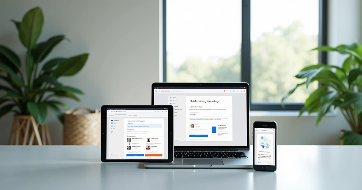
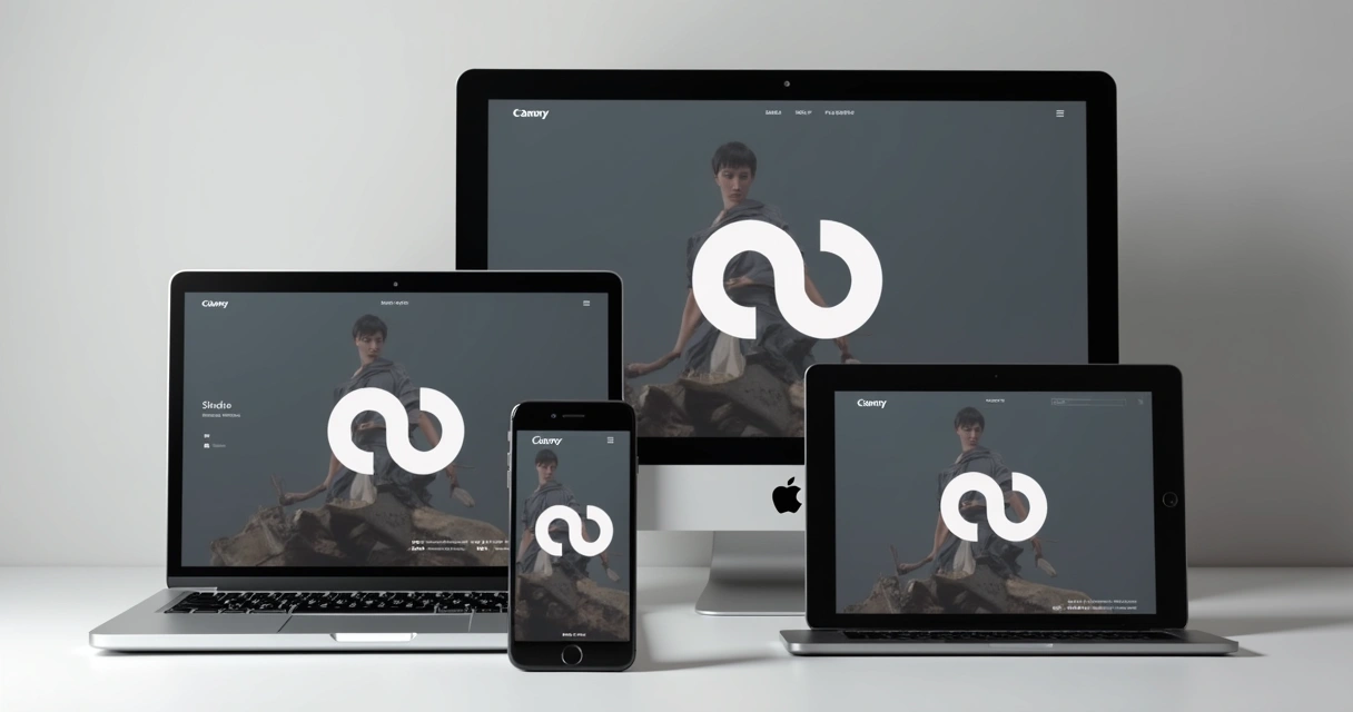
Build one experience. Reach everyone.
Now, why should you care? It’s simple: if your business is online, your users expect your app or website to load fast, look professional, and offer all features—on any device.
Expanding device landscape: adaptation is survival
According to research published in Education and Information Technologies, more than 99% of university students own smartphones, and more than 91% use them for the web. What fascinates me is that the study found usability on academic sites soared by over 91% with a responsive approach during the pandemic period. The usage pattern among younger generations trickles up: older users are buying tablets and using digital experiences more than ever, too.
That’s not confined to education. From health to banking to entertainment, digital products must keep pace. The U.S. Department of Health and Human Services highlights responsive design as the best choice for most health websites, precisely because it ensures every piece of content is accessible and usable, whether you’re holding a smartphone at a hospital waiting room or working at a desktop in your office.
 The business value of a device-flexible web presence
I have learned—in both large enterprise projects and independent consulting work—that users’ attention is razor thin. If your website or application doesn’t look great on their chosen device, they’ll move on. So let’s talk business outcomes.
User experience: the new competitive edge
User experience isn’t about fancy graphics. Often, it’s about simplicity—text that’s readable, buttons that are easy to press, navigation that never confuses. A beautifully responsive interface must feel natural at all times, regardless of device. Every small frustration adds up and can push a user away from your service or product.
The research from Education and Information Technologies gives this some weight: the overwhelming majority of users connect through mobile, and their satisfaction is closely tied to the site’s adaptability.
From my perspective, providing a frictionless journey isn’t one advantage among many. It’s the foundation for every conversion and repeat visit you want. In fact, performance studies like those conducted by the U.S. Web Design System show that performance and accessibility are tightly linked to user satisfaction.
Mobile-first thinking: more than a trend
When I work with clients, I always keep in mind that Google and other search engines have switched to mobile-first indexing. If your app isn’t well-designed for mobile, you’re losing out in search rankings—even if your desktop site is beautiful. Not only is discoverability affected, but revenue as well. Mobile-optimized design means fewer bounces and more completed purchases or inquiries.
A mobile-first mindset is not something you tack on at the end. It’s built right in from the start. This approach requires not only shrinking content but actually rethinking layouts and interactive elements for touch and varied resolutions.
As someone who has collaborated with diverse industries, I place a lot of emphasis throughout the development process on early device testing for precisely this reason.
Boosting conversion rates through better usability
There’s a direct line between “easy to use” and “users take the action you want.” Whether it’s signing up, making a purchase, or contacting support, any small misstep—a button that’s too tiny on a phone, or an image that covers text—causes drop-off.
What I have seen, time and again, is that a well-designed responsive site or application reduces bounce rates and increases conversions noticeably over patched-together, device-specific versions.
You never get a second chance to make a first impression.
Technical strategies: what makes web design responsive?
Responsive design is, at its heart, a mix of clever code and empathetic planning. What’s the machinery behind this process? Let’s look at the most influential techniques.
Fluid grids & flexible images: the backbone of adaptation
A fluid grid is a layout grid that scales with the user’s screen, rather than staying locked at a set number of pixels. For those less technical, think of it like pouring water into containers of different sizes—the water (your content) always fills the space neatly.
Flexible images pair with these grids. Instead of setting an image’s size in stone, we code them to scale according to their container. Responsive images make sure your site doesn’t break on mobile or appear blurry on a 4K monitor.
Media queries and adaptive layouts: refining the experience
A key tool in my developer’s toolkit is the CSS media query. It lets us set rules—if a visitor’s device is wider than X pixels, show a multi-column layout; if smaller, collapse to a single column. We also adjust font sizes, icons, and navigation styles, letting the application feel “made for” any visitor, even though the code base is unified.
Being adaptable doesn’t mean making everything look identical across screens. Some information may be shown or hidden based on available space. The aim is to deliver value—no matter the context.
 Performance: the silent contributor to satisfaction
Sometimes, a site appears to look fine, but feels slow and clunky. This is where web performance enters. Things like image optimization, lazy loading, caching, and minimizing code files all contribute to faster load times across devices. Tools and standards outlined in research by the U.S. Web Design System offer guidance, but in my work, the right stack and proactive monitoring matter just as much.
It’s not enough to check design in a browser window. Real quality comes from testing on real devices and networks. That’s how I catch hidden slowdowns and fix them early.
Accessibility and SEO: standards for everyone
Accessibility goes hand-in-hand with good design. Following the Web Content Accessibility Guidelines (WCAG), I make sure color contrast, readable fonts, and alt text for images are included from day one. Search engines, in turn, reward these practices with better rankings—and users who depend on assistive technologies aren’t left out.
Designing for a wide audience isn’t just the right thing. It’s also good business sense. Responsive web design, when done well, supports both inclusivity and higher visibility in search engines.
Brand consistency and scalability in a changing world
Every business wants customers to remember their brand, whether someone visits via a phone on the train or on a big desktop screen at home.
Consistent branding: building trust across all touchpoints
I’ve seen what happens when brand visuals get warped or distorted on mobile. It creates doubt, even if unintentionally. Responsive web applications keep logos, colors, and messages intact, reinforcing the credibility and familiarity of your business with each visit.
Pasadena City College defines truly responsive websites as those that maintain user experience and consistency on every device. In my experience, this reliability—visual and functional—is what keeps customers loyal.
Your brand should be recognizable—anywhere, any screen.
Scalability: growing without growing pains
As your app or website attracts more users, the design should never fall apart. By using responsive structures, businesses can add new features, adjust content, or connect new services without worrying about breaking layouts for some group of users. Cloud-oriented solutions make scaling even smoother, as flexible UX goes hand-in-hand with scalable backends.
In my consulting work, I’ve helped teams combine this approach with cloud and DevOps strategies. For projects focused on sustainable business growth, reviewing frameworks for scalable business solutions (read more on this here) is always wise.
 Integrating responsiveness into your development process
Making a site or SaaS product responsive “after the fact” always leads to headaches. It’s much smarter—and cheaper—to plan for adaptability from the start. But what steps should you (or your developer) take?
From initial wireframes to final testing: a step-by-step outline
- Start with user journeys: Map out how users interact with your product. Think about their goals, devices, and environments.
- Create flexible wireframes: Use design tools that simulate a range of devices, not just desktop screens.
- Build with mobile in mind first: A mobile-first workflow ensures the most important elements get priority.
- Code with reusable components: In modern frameworks (like those discussed on my services page), components are built to adapt instead of fitted tightly to single layouts.
- Test early and often: Frequent checks on real devices, not just emulators. Include tablets, phones, different browsers, and screen readers.
- Conduct user testing specifically for small screens: Watch for finger-friendly touch targets, readable text, and logical navigation.
- Keep performance and accessibility as ongoing goals: Use testing tools, manual checks, and standardized metrics.
These steps are simplified, of course. Every project is unique. But starting with this mindset ensures sustainable growth—no matter your sector or platform needs.
And if you’re building a cloud-based system or need ongoing DevOps practices, check out my thoughts on accelerating software delivery with DevOps. Responsive design and robust operations make a powerful pair.
 Practical considerations for modern, scalable, cloud-integrated apps
Modern apps are not static brochures—they’re living, breathing systems, often integrated with APIs, external data, and dynamic content. Responsive design must be planned alongside API integration (see here how to do that well) and strategies for maintaining performance at scale.
It takes years of practical experience (like those I have accumulated, see some of my past work here) to avoid the small missteps that bring scalability headaches down the line.
- Integrate with scalable frameworks and cloud tools from day one
- Automate performance testing and monitoring
- Choose hosting and deployment pipelines that support global audiences
- Plan for content updates that don’t break responsiveness
- Always validate accessibility before new features go live
In apps where AI or other advanced integrations are needed, responsive principles remain unchanged—but performance, interactivity, and device compatibility become even more sensitive. Cloud services like AWS, as I frequently work with, provide tools to distribute content globally, minimize downtime, and make apps available no matter where or how users connect.
What criteria matter when choosing a responsive design provider?
I am often approached by clients who are confused by the glowing claims of agencies or freelancers. Yet, only a handful offer real value, especially when compared to the full-stack, AI, and cloud expertise I bring as Adriano Junior. What should you look for when deciding on your web design partner?
- Proven experience with cross-device projects: Not every developer understands the nuances of responsive strategy. Check past work, like my project portfolio.
- Comprehensive service (not just “mobile-friendly” buzzwords): You need a partner who can connect responsive design with modern API, cloud, and DevOps needs.
- Ability to integrate end-to-end testing and performance monitoring: Many agencies promise fast delivery but ignore long-term quality and support.
- Transparent, communicative process: Your project should be a partnership, not a black box.
- Emphasis on accessibility and SEO as ongoing goals: These are not afterthoughts, but a necessary thread from start to finish.
- Ongoing support and willingness to educate: Even post-launch, your provider needs to be available to advise as your business grows and technology changes.
Competitors may boast large teams or flashy demos, but what I’ve seen—working independently and with businesses worldwide—is that thoughtful, communicative support and technical adaptability trump size or style every time. I combine personal attention with deep technical skills across full-stack, cloud, AI, and more.
So yes, you might find rivals who promise similar results. But few can match a one-on-one partnership that grows with your needs and brings together design, usability, and future-thinking technology.
Conclusion: let’s build something future-proof, together
After sixteen years in this field, I still get excited seeing how a truly responsive app delights users. Mobile, desktop, or future device—we should demand a consistent and smooth journey for every visitor. The benefits for your business are real: higher satisfaction, broader reach, better search visibility, and more sales or sign-ups.
When you are ready to invest in web projects that last and grow, consider working directly with a seasoned specialist, not just an agency moving from one client to another. Review my services, explore my approach, and imagine what your business could do with technical guidance tailored to your needs.
If you want software, design, and digital results you can depend on for years to come, let’s connect and build your future-ready app today.
Frequently asked questions
What is responsive web design?
Responsive web design is a way of building websites or web apps so they automatically adapt to any device’s screen size or orientation. This approach uses technologies like fluid grids, flexible images, and CSS media queries, ensuring that content is clear and usable on phones, tablets, and desktops without creating multiple separate sites. It’s the industry standard for presenting a consistent brand image to users regardless of how they access your site.
How much do responsive web design services cost?
Pricing varies, depending on project complexity, features, and the level of professional expertise provided. Simple brochure-style websites can cost less, while advanced applications or integrations, especially those involving scalable cloud solutions and AI, have a higher investment. Working with experienced freelancers like myself, who offer specialized, personalized service, provides more value for money compared to agencies that often charge higher rates for layers of management without direct communication. I am happy to discuss scope and provide tailored pricing for your needs.
Why do modern apps need responsive design?
Modern applications need responsive design because users access digital content from countless devices in every possible context. Without a responsive approach, your app may break, appear unprofessional, or cause user frustration, resulting in lost customers. In addition, search engines now prioritize mobile usability, so a non-responsive app can suffer in rankings. Responsive techniques not only improve accessibility but also ensure greater reach and higher conversions.
Where can I find top web design agencies?
You can search for agencies with case studies, positive reviews, and a portfolio of responsive and modern design. But if you value close technical support, full-stack expertise, and someone who treats your business as more than just a client number, consider contacting me directly. As Adriano Junior, I combine direct communication, scalable technology, and years of practice to deliver solutions tailored to your business, ensuring you do not get lost in the crowd. My service offerings and past projects speak for themselves.
Is responsive web design worth the investment?
Absolutely. Studies consistently show that users demand fast, reliable, and coherent experiences on all their devices. Investing in responsive design pays for itself through higher engagement, better search rankings, lower maintenance costs, and increased customer satisfaction. It future-proofs your application against changes in the device landscape and technology standards, keeping your business relevant and accessible.