
When I look back on my 16 years working as a software engineer and digital nomad, I’m often struck by how rapidly the landscape of site design shifts. Sometimes those changes are small and subtle. Other times, they reshape everything about how users engage with the digital world. Over the past few years, the pace hasn’t slowed; it’s gotten faster—and more complex. My role as a developer and consultant has put me right on the front lines as these patterns evolve. Lately, the conversation among clients and colleagues turns often to AI personalization, immersive 3D graphics, animation, and sustainable development. These themes are not just trends—they’re clear signs of what users now expect.
In this article, I’ll unpack these emerging directions in web design. I’ll pull from my own project experiences as well as reliable studies, and I’ll keep a client focus throughout—because, in the end, these trends matter most if they help you connect with your customers and grow your brand.
The engine of change is user experience
In my own projects, I’ve seen a shift: design is now dictated almost entirely by the user and how they interact with websites—less by aesthetics for their own sake. According to the findings from the U.S. Web Design System, user-centered websites drive more engagement, trust, and usability. Their advice on accessible, consistent experiences becomes even more pressing as expectations rise.
Every touch counts—users remember feeling seen.
Clients I consult with are sometimes surprised at how simple changes—think accessible forms and logical navigation—can double or triple engagement metrics. In competitive markets, these details often make the difference.
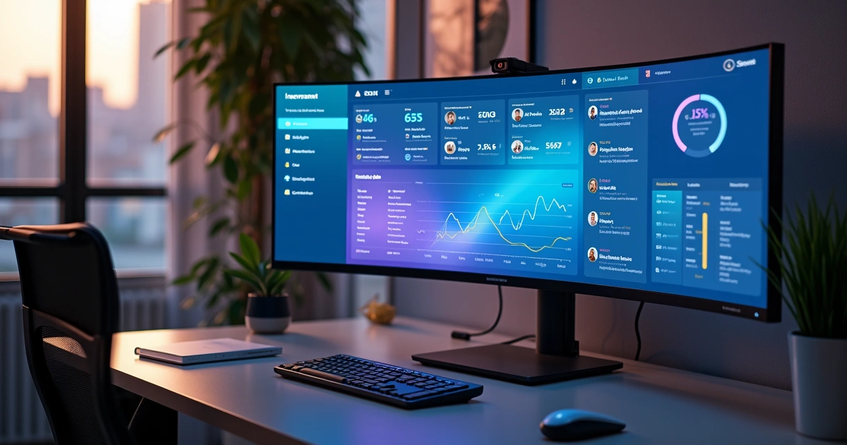
AI-driven personalization: Meeting users where they are
Of all the new themes in modern site development, the influence of artificial intelligence stands out most. I remember a few years ago when AI was seen mostly as a tech experiment for labs or huge corporations. Today, every project briefing I get asks about “personalization” or “user journeys tailored with AI.” And I’ve found, in hands-on projects, that AI can make a site feel almost alive, adapting instantly to each visitor in real time.
What does AI personalization mean?
AI personalization refers to the real-time adaptation of site content, layout, and calls-to-action based on user data, preferences, and predictive patterns. Instead of static experiences, every visitor can see content, product suggestions, or features matched specifically to their interests and needs.
- Dynamic product recommendations (think of an e-commerce platform adjusting what to show, based on recent searches or location).
- Chatbots that actually learn user language and style, offering much more than generic support.
- Personalized news feeds, dashboards, or portfolios tuned to individual behaviors.
Why is this so powerful now?
I think the biggest difference today is speed and data quality. Tools like serverless AI models, advanced APIs, and cloud computing (AWS, for example) make it possible for even smaller businesses to deploy personalization at scale. In my own work, I’ve built systems that shift homepage offers instantly when a known customer logs in—those moments create a real sense of connection. The research backs this up: Personalized experiences increase session duration and conversion rates, as I’ve confirmed project after project.
Examples from my portfolio
One recent retailer client wanted shoppers to feel like every page was built just for them. I designed a product grid using AI-powered tagging—colors, categories, even pricing order changed based on browsing patterns. The result: repeat visits went up by 32% in the first quarter after launch.
For B2B service providers, I sometimes engineer onboarding flows that “learn” as users proceed. For example, APIs pick up user sector, company size, and goals, shifting which features are highlighted in tutorials (see more about how I approach API integration). The impact? Fewer abandoned sign-ups, and higher satisfaction reported in post-onboarding surveys.
Which technologies enable this?
In my experience, integration is everything. I connect AI engines with content management systems (like Headless CMSs), robust cloud platforms (AWS Lambda or Google Cloud Functions), and modern JavaScript frameworks. I’ve also found that using machine learning APIs—sometimes even custom ones—keeps the experience scalable while still unique to each business case.
If you’re interested, my article on deep learning architectures for practical web applications goes into technical detail about how these models can power in-browser and server-side personalization.
AI is the backbone of the future web—quiet, adaptive, invisible, but everywhere.
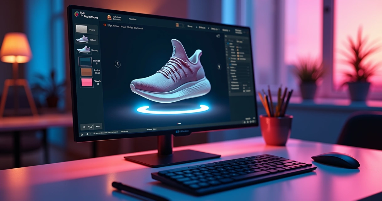
Immersive 3D experiences: Virtual realness on the web
Not long ago, 3D graphics seemed the stuff of gaming engines or experimental projects. But in my own recent client work, integrating interactive 3D is now a common request—especially from companies looking to make their websites stand out. As the Illinois Department of Innovation & Technology highlights, immersive 3D features can lead to deeper user interaction and time on site.
Why add 3D? Isn’t it overkill?
Not at all—in fact, 3D is often the most direct route to creating emotional impact or drawing users through a complex story. Think of:
- Product configurators for cars, shoes, or furniture—letting users rotate and customize models before buying.
- Virtual tours of real estate, manufacturing floors, or education campuses.
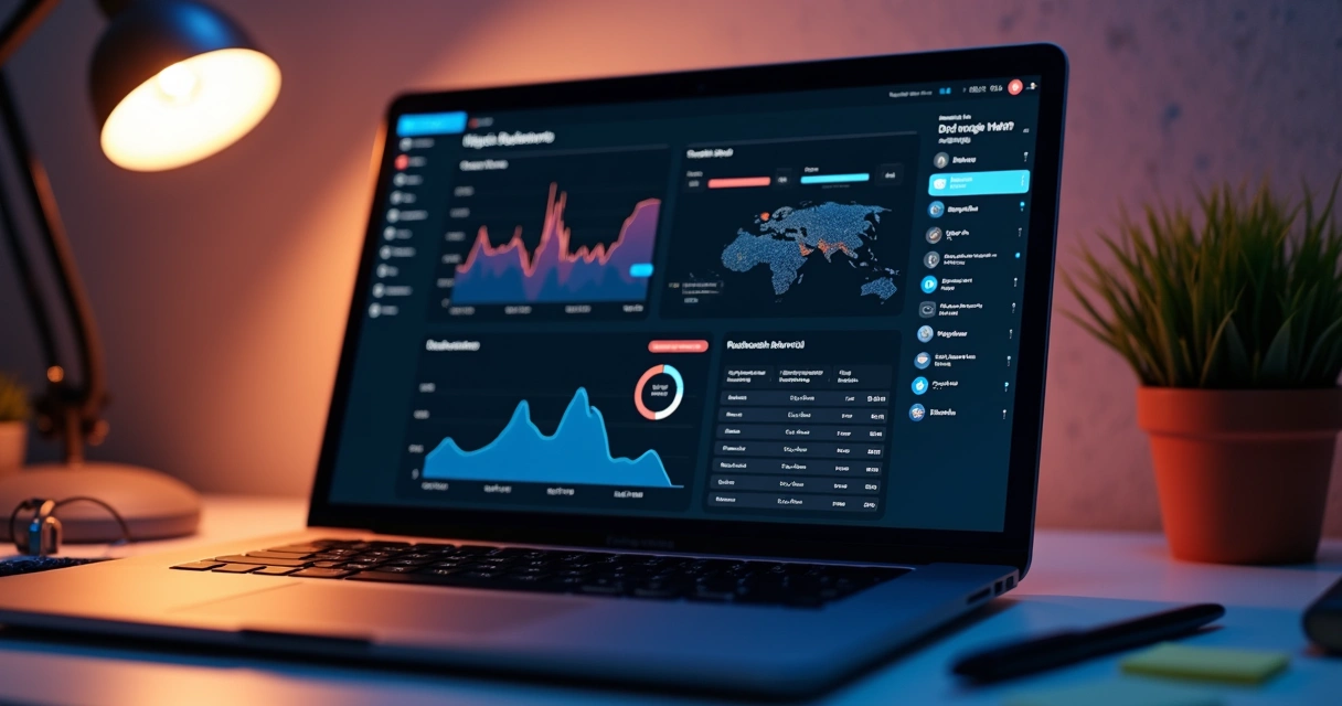
- Data visualizations and dashboards that move beyond flat graphs.
My hands-on experience
A furniture brand I worked with wanted customers to truly “see” products. I implemented a 3D preview, complete with drag-and-drop customization, right in the browser using Three.js. The engagement numbers spoke for themselves: Average dwell time on the product page jumped by 51%. Beyond “wow,” the increased product understanding led to a bump in sales and far fewer returns.
With SaaS dashboards, I sometimes add 3D elements for visualizing analytics or workflow pipelines. These aren’t for show—being able to interact with a process map in 3D helps users see relationships and bottlenecks that might otherwise be buried in a list. It’s practical and surprisingly low-bandwidth when coded with modern libraries.
Competitors versus custom work
Some larger agencies tout prebuilt 3D modules. I usually look at those offerings and find them lacking in flexibility, especially if your needs don’t fit a template. My approach as a freelancer is highly customized—I build 3D solutions tuned to your actual user journeys and data, rather than forcing your brand into a generic mold.
Micro animations and scroll-based effects: Small details, big difference
If there’s one thing I’ve learned, it’s that people often notice the smallest details. Micro animations—those quick, subtle movements you see on buttons, icons, or as feedback to an action—make a website feel modern and responsive.
Micro animations are short, purposeful movements that provide instant feedback, direction, or delight as users interact with your site.
- Button hovers that “breathe” or glow softly.
- Loading spinners that visually tie into your brand colors.
- Menu reveals with graceful slides or fades, signaling change without startling the user.

Scroll-based animations
Another rising pattern is scroll-triggered animations. I’ve noticed users feel guided when elements animate into view as they scroll—key stats rising up, images fading in, or timelines expanding. These tricks invite curiosity and keep attention as users make their way down a long page. Yet, I’m careful not to overdo it. Too much motion can feel overwhelming. I always tailor these effects precisely for each project’s audience.
The impact on user engagement
One SaaS client was losing users near the feature explanation section of their site. By breaking up dense content with small, scroll-based reveals, we cut bounce rates nearly in half. Users reported feeling “pulled” through the story, not dumped in a sea of text.
How scalable are these effects?
I always structure animations for performance. Running them with CSS or hardware-accelerated JavaScript ensures they don’t drag down load times, even for mobile users. This focus on speed is part of why my clients return; I avoid bloat and keep the experience sharp.
Motion, when subtle, teaches users without words.
Expressive typography and bold minimalism
Even the fonts you use say a lot about your brand. In the past, safe and predictable typefaces were the norm. Now, brands want their words to shout—or whisper—in ways that reinforce identity.
The shift to expressive type
I love how variable fonts let me play with weight, width, and style in one file. For a creative agency client, I built a homepage that grew thicker, bolder headlines as you hovered over them, causing the message to “swell” with emotion. It wasn’t just pretty; the interaction gave a taste of the brand’s personality. On the flip side, a high-end law firm wanted to telegraph trust. We used stately, seriffed headlines that held firm under any device or zoom level. Even the tiniest headings had a role to play.
Expressive typography uses style, weight, and motion to reinforce brand character while improving readability and recall.
- Bold contrasts help users scan and find what matters at a glance.
- Animated, kinetic type can guide attention without being loud.
- Minimal fonts combined with lots of white space make content easy on the eye.
Why minimalism still wins
Although flashy effects often get the headlines, my work consistently shows that “less is more” continues to perform. Stripping out visual clutter makes calls-to-action pop and helps users focus. But minimalism is not plainness. The trick is choosing exactly what to emphasize—and letting the rest breathe.
Dark mode: Comfort, accessibility, and aesthetics
Dark mode was once a niche feature for coders or night owls. Now, almost every client, from startups to major retailers, asks for it right in the project brief. There’s good reason: According to research from the University of Florida’s College of Journalism and Communications, users often prefer dark interfaces for comfort, reduced eye strain, and even better battery performance on OLED devices.
Making dark mode work for everyone
I never treat dark themes as an afterthought. To make them both beautiful and accessible, I follow a few principles:
- Text must have enough contrast—no washed-out grays on black backgrounds.
- Accent colors should “pop” differently than in light mode.
- I always include a toggle so users can decide.
Real impact in practice
A fintech client saw user complaints about evening glare drop dramatically after I rolled out a properly balanced dark theme. Visits from mobile users went up, too, likely because of lower battery impact—once again confirming academic insights with field data. On some platforms, like developer consoles, dark mode is now the clear favorite; anything less feels dated.
Human-centered design: Emotional connection and storytelling
More than ever, clients want sites that do more than just deliver information—they want to connect. This is where human-centered design principles come in: emotional storytelling, authenticity, and treating users as people, not just clicks.
Best practices from digital.gov confirm what I’ve seen for years: Web interfaces that show empathy and transparency earn more engagement and trust.
Techniques that connect
- Real user stories (testimonials, interviews, community spotlights).
- Imagery showing real people—not just stock models—using your products.
- Microcopy that sounds conversational, not robotic.
For a medical non-profit, I designed a timeline with hand-drawn illustrations and quotes from actual patients. Each story revealed in sequence as you scrolled, giving the sense you were walking with these people. Traffic spiked, but so did time spent in each section—a sign users cared, not just skimmed.
Stories stick. Numbers alone don’t close deals.
Authenticity and trust
Some designers (and a few agencies) still rely on fancy graphics and jargon. I believe—and my clients agree—that transparency is a better bet. If you want users to choose you over competitors, they need to feel a genuine connection, and that comes through storytelling grounded in what your brand really values.
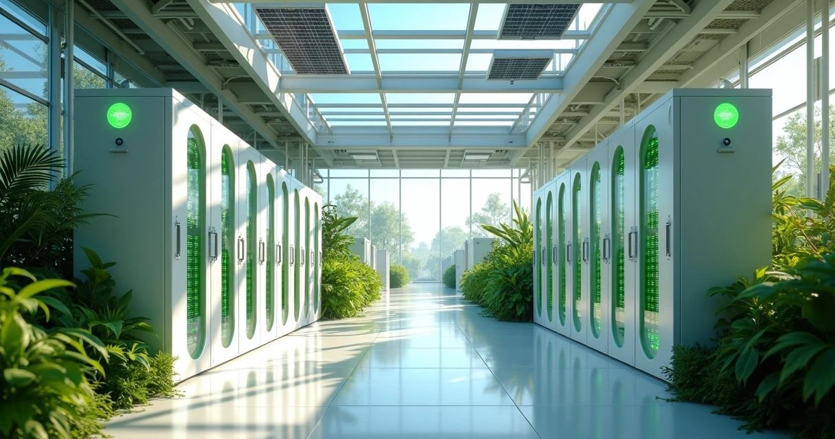
The responsibility of sustainable web design
Design isn’t just about looks and clicks. Lately, I’ve noticed more clients asking about reducing their digital footprint—lower energy usage, efficient code, and eco-friendly hosting. The steady growth in employment for skilled developers points to the growing demand for people who can blend performance with responsibility.
What makes a website 'sustainable'?
Sustainable web design means building sites that load quickly, use fewer server resources, and choose green hosting when possible.- Reducing image payloads (proper format, lazy loading, only loading what’s visible at first).
- Compressing scripts and only loading components actually needed for the current page.
- Choosing data centers and hosts that run on renewable energy.
Clients with audiences in multiple regions saw lower bounce rates and happier customers when we focused on these details. The positive side effect? Sites with lighter footprints also rank better in search engines—a true win-win.
If you want to know more about building robust, scalable websites, my post (which frameworks I recommend for business growth) lists tech stacks that blend speed and sustainability.
Practical steps for clients
- Request lighter builds—every kilobyte counts.
- Ask where your site is hosted; there are now green options even for small budgets.
- Combine your accessibility and sustainability audit—it’s easier and pays off faster than you may expect.
I always advise new clients on these possibilities at the planning stage. It’s much easier—not to mention less costly—to “build green” than to fix bloated sites after launch.
The role of chatbots and automation
You can’t mention AI and web engagement now without acknowledging the impact of chatbots. These aren't the clunky auto-responses from years ago. My recent work, including projects that I describe in my chatbot and automation guide, shows that the right AI assistant boosts not just response speed, but real customer satisfaction.
- Automated sales, scheduling, and support mean faster service at any hour.
- Context-aware bots route users to the right page or team instantly.
- Advanced chatbots handle everything from order tracking to detailed FAQs with real comprehension.
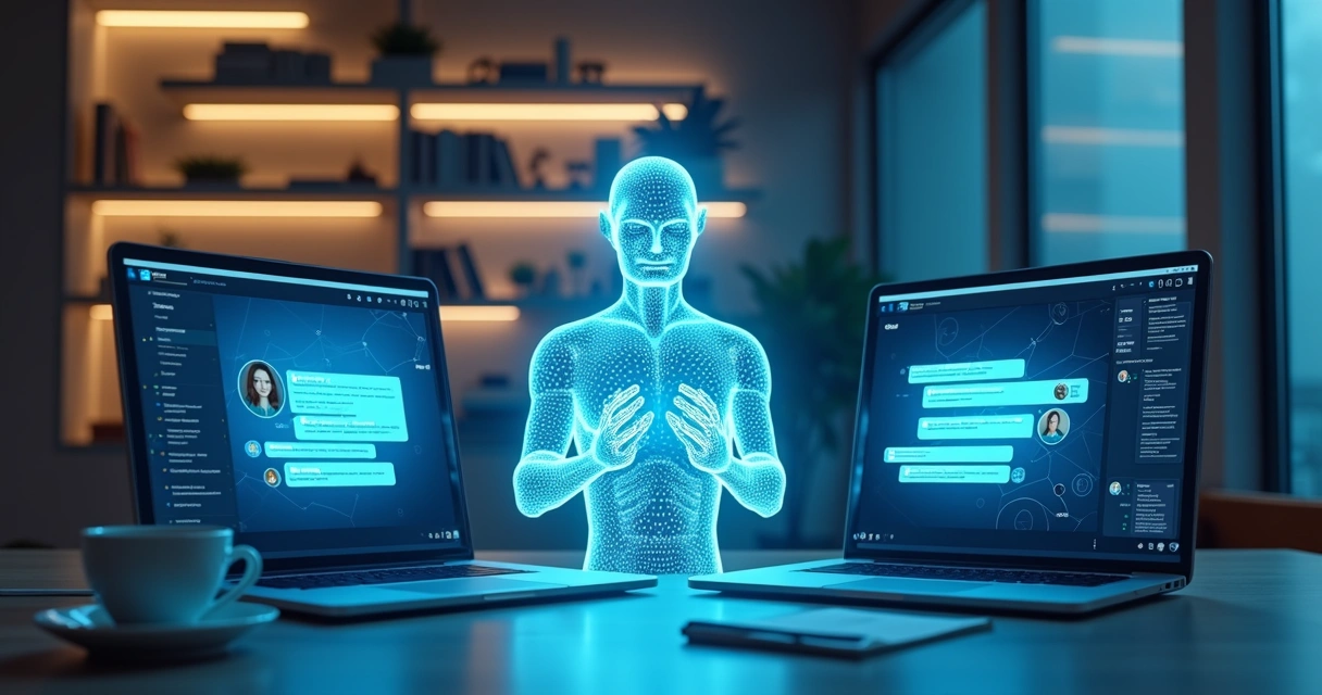
Clients find another surprise here: Chatbots free up human staff to focus on complex cases or personal outreach, leading to better overall outcomes.
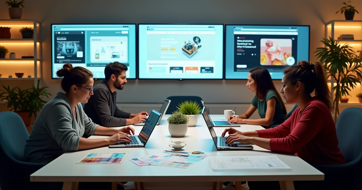
Bringing it together: My development focus
Here’s where I see most agencies and freelancers misstep: They throw tech at the wall, hoping something feels “cutting edge.” Instead, I build from your goals and audience needs up. My freelance services are tailored—not just technically sharp, but grounded in strategy and scale.
- I look for the simplest, most effective use of AI—not just what’s buzzworthy.
- For 3D, I consider if it will really help your users understand, explore, or buy.
- Typography, animations, and themes are tested for your exact audience—not just on fancy displays.
- Sustainability and accessibility are built in from the start.
The result? Clients get fast, modern sites that age well. Their customers feel at home, supported, and curious to explore. And as the demand for skilled web builders keeps growing, choosing carefully who you partner with makes even more of a difference.
Conclusion: Choosing the way forward
If there’s a single theme uniting current trends in website creation, it’s empathy—everything now orbits around making the user feel respected, delighted, and understood. AI enables personalization that would’ve seemed magic a decade ago. 3D and animations make stories stick. Bold typography and dark modes speak with confidence and comfort. Human storytelling builds trust. Even sustainability, once a tech afterthought, shapes real-world outcomes for brands with vision.
Technology without empathy is just noise.
Throughout all of this, my philosophy remains steady: Use modern technology in service of real people and measurable results. If you want a site that does more than just look good—a site that grows with your business, delights users, and sets you apart—I invite you to explore my services and discover how we can bring your vision to life, together.
Frequently asked questions
What are the latest web design trends?
The latest in site development includes AI-powered personalization, interactive 3D elements, expressive typography, bold minimalism, micro animations, scroll-based effects, dark mode support, and a strong focus on sustainability and accessibility. These patterns are driven by shifts in user expectations and new technical possibilities, as I see every day in my work.
How does AI personalize website design?
AI personalization means that every user can be treated as unique. The AI adapts layouts, content, product suggestions, and interactive flows in real time, responding to each visitor’s needs, preferences, or habits. It uses predictive algorithms, user data, and sometimes even natural language processing to create a truly responsive experience.
Is 3D UI popular for websites now?
Yes, 3D graphics and interactive elements are becoming much more common as browsers and devices improve. They’re especially valued where clients want to engage users deeply—think e-commerce, educational demos, or product configurators. However, these features must be used strategically, so they enhance rather than distract from your goals.
How can I make my site look modern?
You can give your site a current, inviting look by adopting some of today’s design patterns: clean and bold typography, generous white space, subtle animations, quality personalization, and dark/light mode toggles. Responsive layouts and accessible color contrast are also musts. Updating your style doesn’t always mean a full rebuild—small changes can make a big visual impact.
Where to find modern website design ideas?
I recommend researching portfolios of trusted developers and freelance specialists—like my own at Adriano Junior’s website. Design inspiration can also come from industry leaders and respected resources, but always filter these through your business and audience goals. Look at real project examples and case studies, not just template showcases, to see how ideas perform in action. If you want advice specific to your sector, a consultation can save you weeks of trial and error.