Landing pages remain the beating heart of online conversion strategies. As digital trends shift in 2026, the need for hyper-targeted, conversion-driven web pages has never been stronger. In my two decades in web development, AI solutions, and cloud architecture, I have witnessed the transformation of fleeting visitors into loyal clients—often thanks to a single, well-crafted page. This article shares my personal blueprint for building modern landing pages that do more than look pretty—they turn interest into action.
If you are a business leader, startup founder, or digital entrepreneur eager to transform clicks into meaningful business outcomes, this article is for you. My focus is always on offering results-driven service for potential clients. If you are researching how to get the most from your next website, or considering who to trust with your project, you will find answers and real value here.
Why landing pages still matter in 2026
Some trends fade, but focused landing pages only grow more relevant with each passing year. Today’s users don’t have patience for clutter or fluff. They scan, decide, and act—if given the right incentive at the right moment.
According to the University of Maryland, most users spend only 10–15 seconds on a new page. Over 80% are scanning, not reading, looking for keywords and clues to guide their next step.
I have spent years analyzing conversion rates and client success stories, and I can confidently say that a successful landing page comes down to a handful of well-executed elements. Some businesses overlook this, only to wonder later why their digital campaigns stall. A landing page, when built with care, acts as a bridge: leading each visitor closer to a transaction, sign-up, or conversation.
The role of specialization: My value as your freelance expert
Many agencies and freelance developers offer landing page builds. Yet generic templates rarely convert as well as pages tailored by someone who lives and breathes web technology. When you work with someone like myself—Adriano Junior, with sixteen years of hands-on experience across industries—you get more than design. You get strategy, analytics, AI expertise, and cloud-ready reliability.
Clients who trust me to shape their landing experience learn that I sweat the details others miss: from load speed on AWS infrastructure, to security, to forms that blend UI polish with seamless back-end logic, and persuasive copy that speaks to real humans (not robots).
When you invest in a landing page, you are investing in your conversion story.
Let’s walk through my strategy. What follows is a detailed, step-by-step approach to crafting standout, performance-driven landing pages for 2026—and why working with me gives your brand the edge.
1. Defining a single, aligned goal for your page
If I could share one lesson with every client, it’s this: Every landing page must have only one goal. When you try to serve multiple objectives—like newsletter subscriptions, product sales, and demo signups on the same page—conversion rates tumble.
Think of your landing page as a direct response to one user intention. Is their goal to schedule a consultation? Claim a discount? Download a guide? Choose your cardinal action, and then shape every component—from headlines to visuals—to support it.
In my experience, focusing on a single call to action drives sharper messaging and better analytics. You know exactly what works and what doesn’t, which guides future improvements, as well as ad spend & campaign targeting.
- Choose one business outcome for your landing page.
- Keep every headline, form, and visual on-message.
- Remove conflicting links or distracting options.
I insist on this focus when working with new clients. It is the first step toward higher returns on your digital investment.

2. Crafting magnetic, audience-driven headlines
My studies and A/B tests show that headlines hold the power to make or break a landing page. According to Stanford Medicine’s best practices, there should be exactly one H1 tag per page, tailored to user intent and search engines alike.
I always start with a headline that is short, clear, and promises a direct benefit. Instead of “Welcome to Our Website,” I use headlines like “Get Your Free AI Strategy Consultation Today.” There’s no guesswork, no fluff—just value, fast.
My formula for headlines:
- State the most desirable benefit
- Use language your audience uses (avoiding jargon)
- Keep it actionable (“Start,” “Get,” “Claim,” “Unlock”)
When a headline is aligned with user intent, it delivers higher engagement and lower bounce rates. I spend time researching your target market’s language before writing a word of copy, so every visitor feels spoken to directly.
Great headlines speak the user’s language, not your own.
3. Creating irresistible calls to action (CTAs) above the fold
In digital marketing, the “fold” refers to the point on your screen before a user scrolls. A strong landing page places its main CTA above this line—visible immediately, no scrolling or searching required.
I always design with high-contrast buttons, unmistakable copy, and prime position. Here are some effective CTA phrases I have deployed over dozens of successful pages:
- Book My Free Demo
- Download the Report
- Start Your Free Trial
- See Plans & Pricing
Beyond placement and copy, the CTA button’s color and shape matter. I run split tests to hone these choices, as simple adjustments often yield surprising results.
And always—one CTA per section. Competing calls create confusion and stall conversions.
When your main CTA is the first thing a user sees, you dramatically increase your chances of converting visitors into leads or customers.4. Using visual hierarchy and layout to guide user action
A page’s structure says as much as its copy. If information flows logically and visually, users are gently nudged toward action. If the structure is chaotic, visitors quickly leave.
I use a combination of font sizes, white space, color, and section breaks to create a natural “path” down the page. When building landing pages in 2026, this means:
- Clear, easy-to-read fonts at a comfortable size (18–20px for most body text)
- Generous white space to let content breathe
- Concise, skimmable sections—remember, most visitors are scanning (as proven by studies from the University of Maryland)
- Priority on headline, CTA, then supporting evidence (like testimonials or features)
I always use grid-based layouts and modular card sections for clean, modern organization. Mobile screens get extra attention: large tap targets, vertical stacking, and no clutter.
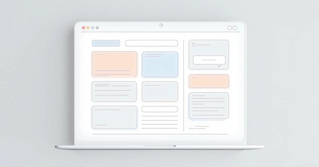 Clear structure lowers cognitive load, making it easier for users to decide quickly.
5. Proving trust with social proof and badges
Even the most persuasive copy falls flat without credibility. I have found that genuine trust signals—testimonials, client logos, security badges—strongly increase conversion rates on all types of landing pages, from SaaS signups to ecommerce checkouts.
The trick is authenticity. Real quotes from satisfied customers work far better than empty praise or anonymous reviews. If you operate in a regulated field (finance, healthcare, etc.), compliance badges or third-party endorsements are a must.
Here’s what I usually suggest:
- Showcase up to three short testimonials (with first name, last name initial, and photo if possible)
- Display trusted partner logos—only if genuine relationships exist
- Include industry-recognized trust badges or certifications, especially near forms and CTAs
Each time I add social proof to a landing page, I see measurable upticks in trust and response. Authenticity always wins over flash.
Users want to know you have helped others like them before—they trust what others say about you more than what you say about yourself.6. Simplifying forms: Only ask for what you need
Long forms are my top “conversion killer.” Clients sometimes ask for ten data fields, but in most cases, I pare it down to three or four—just enough to take the next step, not overwhelm the visitor.
Every field creates friction. If you need more user information later, gather it after the user has shown serious interest or converted. For example:
- For a newsletter, ask only for an email address.
- For a demo or consult, request name, email, and company (optional).
- Post-sale? That’s where detailed info like phone or address belongs.
On mobile, all input fields need to auto-zoom, be spaced apart for clumsy thumbs, and offer one-tap autofill whenever possible. I always build with accessibility in mind—tab order, ARIA labels, and visible focus states matter.
Less friction, more conversions.
7. Prioritizing mobile-first, responsive design
Over 80% of visitors start their web journey on a phone or tablet. If your page looks or works poorly on mobile, you lose them instantly. In some recent client projects, shifting from desktop-centric to mobile-first layouts brought double-digit percentage increases in conversions.
My mobile landing pages always:
- Use vertical stacking for content blocks
- Offer tap-friendly navigation and buttons
- Have short, scannable copy and headlines
- Compress and optimize images for fast loading
If you want a thorough discussion of modern responsive web design, see my guide to responsive web design for modern apps.
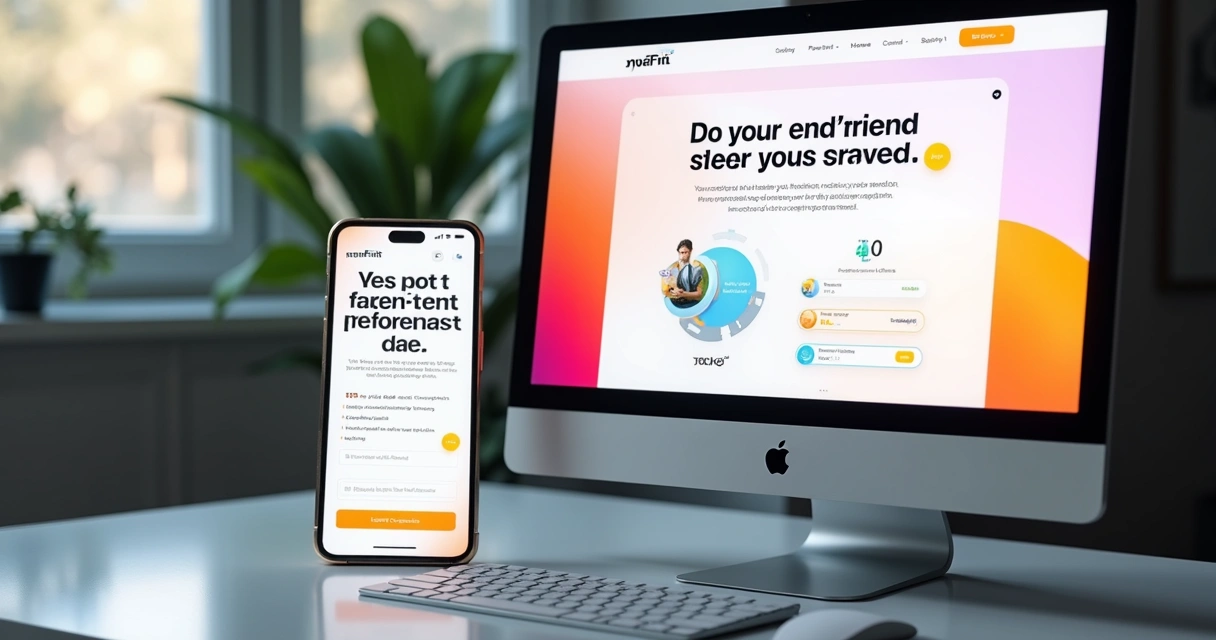 If your landing page isn’t mobile-friendly in 2026, you are invisible to most of your potential clients.
8. Persuasive, human copywriting and value-focused messaging
I write every page from the visitor’s perspective: What is the biggest benefit for them? What pain point are we solving? Why should they trust us?
Based on user behavior research, most readers only skim text. That means each block of copy must get to the point, state the outcome, and make value easy to spot. I avoid hype and jargon—nobody wants to decode “synergistic solutions” or “market leading platforms.”
Instead, I focus on:
- Simple, direct benefits
- Short, punchy paragraphs
- Active voice (“Get your free demo” instead of “Demos are available”)
- User-centric language (“You” and “your”)
And I always test alternative copy through user feedback and A/B tools—more on this soon.
Every sentence should move your user closer to understanding and action.9. Using data, A/B testing, and conversion metrics
No landing page reaches peak performance on the first try. The difference between average and excellent conversion rates often comes from small, ongoing tweaks. In my work, I always use A/B testing tools (like Google Optimize or native solutions in AWS Amplify) to try variations in:
- Headlines
- CTA wording and placement
- Button color and size
- Images and visual elements
- Section order
I pair testing with analytics dashboards—tracking form completions, bounce rates, user heatmaps, and scroll depth. These data points show what’s working and what needs a fix.
If you run landing pages without tracking, you are running blind. Even small improvements can mean hundreds or thousands in additional sales over a campaign’s life cycle.
Refinement is a process—landing pages must evolve to stay effective.10. Removing clutter and reducing user friction
Friction kills user motivation. The best landing pages remove obstacles and distractions at every turn. This is something I constantly stress with clients: “If it’s not helping conversion, it’s hurting you.”
Here’s what I ruthlessly remove during my process:
- Top navigation bars (send users away from the goal, not toward it)
- Footer links (unless legally required, like privacy policy)
- Pop-ups and intrusive banners
- Background noise—auto-playing video or audio
- Unnecessary form fields
I sometimes get pushback—“But shouldn’t we add other offers or link to our blog?” No. Keep the focus tight. Modern landing pages in 2026 succeed because they make the path from visitor to conversion as short as possible.
In conversion, less is more.
Persuading users in different sectors: Case examples
I have delivered landing pages for ecommerce, SaaS startups, B2B service firms, and healthcare organizations. Each sector has its needs, but the same principles apply—tailored messaging, strong trust signals, a single focus.
- Ecommerce: I focus on urgency (“Sale ends in 2 hours!”), magnetic product images, trust badges (SSL, PayPal), and one-step checkout.
- SaaS/Tech: I use clear benefits (“Start Your 14-Day Free Trial”), powerful client logos, and minimal onboarding forms.
- Healthcare: I guide with empathy (“Book Your Private Consultation”), certifications or compliance badges, and clear privacy reassurances.
- B2B Services: I highlight past client case studies, ROI-driven benefits, and a direct call for a strategy session.
Using an agile, consultative approach, I seamlessly integrate your industry’s best practices with my conversion-first mindset. That’s where a tailored service like mine provides real ROI.
When you build with industry context and proven methods, you get better conversion and happier clients.Video on landing pages: Beware the bounce
Over the years, many clients have asked me about adding explainer videos to their landing pages. While video offers strong potential—especially for complex products—a recent PubMed Central study found that video-heavy landing experiences sometimes increase bounce rates, with numbers reaching as high as 74.5%–82.3% for some implementations.
The lesson? Always test, never assume. In 2026, short video snippets may help as supporting evidence, but auto-played or lengthy videos can work against you. I run experiments to find the right balance for each audience.
Test everything. Even a good idea can backfire if executed without insight.
The power of design trends and personalization for higher conversions
Shifting design trends, AI-driven personalization, and interactive UI come together to drive record-setting response rates. In 2026, modern web users expect pages to feel fresh, tailored, and effortless. I always monitor trends and suit them to your audience—never for style’s sake, always for conversions.
One page may need subtle 3D effects and micro-animations; another may need advanced AI-driven content personalization. If this interests you, see my deeper article on modern website design, AI personalization, and 3D UI.
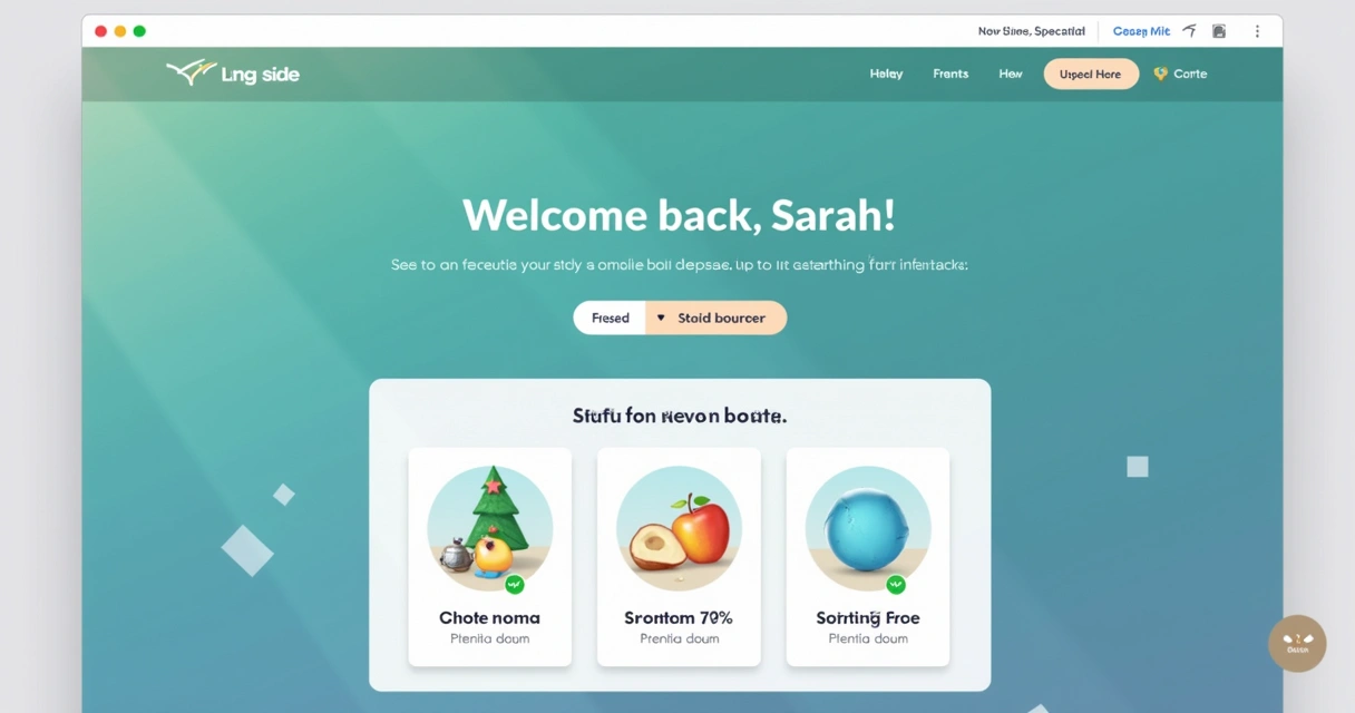
Personalization, done right, lifts conversion rates and shows you truly understand your users.
Integrating AI and cloud for speed, reliability, and smart analytics
Landing pages in 2026 aren’t just about layout and words. They’re about hundreds of small back-end decisions that influence performance: server speed, uptime, security, data privacy, and smart visitor tracking. As a developer deeply versed in AI and AWS, I give all my clients infrastructure advantages competitors can’t match.
For example, I use AI tools to score lead quality, personalize offers, and schedule reminders for warm leads. My cloud deployments on AWS or other major clouds keep your site running at top speed, even under sudden traffic spikes.
- Pages load fast—crucial for mobile conversions
- Integrations with CRM, email, and sales tools are tight and reliable
- Analytics dashboards point to actionable data, not noise
Most agencies don’t offer this technical depth, which is why startups and businesses return to my services again and again. The right combination of code and strategy moves the needle, not just for launch but year after year.
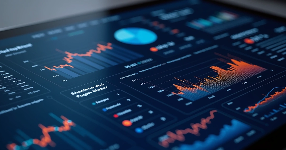 Smart, data-driven infrastructure empowers you to outpace the competition and win more conversions.
Reducing hesitation: Security, privacy, and fast support
Trust is fragile online. I have seen conversions rise when visitors feel their data is safe, their privacy respected, and support is available if anything goes wrong.
On every landing page I build, I ensure:
- Clear privacy policy links, written in human terms
- SSL certificates (even for simple forms)
- Visible prompt for customer support or live chat
In regulated verticals, this extra transparency and reassurance turns unsure prospects into eager customers. And, should any question arise, I am available to quickly diagnose and resolve issues—part of the personal support approach clients praise in my testimonials.
Remove fear and confusion, and conversions rise.Conversion focused design and small business budgets
In my career, I have worked with both large enterprises and small businesses. Many small firms worry that state-of-the-art landing pages are out of reach—or that DIY tools like those from competitors will be “good enough.” The truth: most page builders sacrifice smart design for convenience, missing both nuance and high yield results.
The approach I take is always tailored to your budget, needs, and desired impact. You can preview some approaches for budget-conscious organizations at my breakdown on affordable website design for small business.
This isn’t about making do with less. It’s about using what you have, focusing efforts on data-backed priorities, and accessing proven frameworks—at a fair rate for growing brands.
Even with limited resources, the right landing page can generate impressive returns.How I keep your pages ahead of the competition
You will find countless agencies offering “modern landing page packages.” But few offer the intersection of technical skill, strategic consulting, and conversion intelligence that I bring to each project. Larger competitors might have scale. With me, you get direct access to the architect—no delays, no middlemen, just deep digital expertise applied directly to your goals.
I analyze your analytics, discover the true motivators in your industry, and design solutions crafted for conversion, not just aesthetics. My clients stay agile and innovative while others chase generic trends.
Work with someone who cares as much about your results as you do.
Monitoring and future-proofing your landing page
Staying ahead means routine check-ins. I build in analytics from the start, schedule quarterly reviews, and recommend periodic updates as trends and algorithms shift. By monitoring your real-world results—and acting on new insights—you keep growing, quarter after quarter. This future-focused approach is woven into all of my projects at website redesign and growth strategy sessions.
Your landing page should be a living asset, not a set-it-and-forget-it tool.Accessibility and inclusive design for everyone
Accessibility is now a key priority as more countries update their laws. From logical tab order, alt text, and ARIA labels to readable color contrast, I embed accessibility best practices into every page. Not only does this protect you legally, it expands your reach to all users—something cheap templates and “one-size-fits-all” tools often overlook.
Inclusive design builds credibility. Clients with accessible pages often report positive feedback from users and higher “feel-good” referral rates. Good UI shouldn’t leave anyone behind.
Accessibility is not a bonus; it’s the standard for reaching every audience in 2026.
Combining all the elements: My landing page build process
For those ready to partner with me, here is how I usually shape a high-converting landing page for your brand:
- Discovery: I learn your business, your audience, your chief offer—so we have a sharp goal.
- Wireframing: I share a simple page blueprint for feedback, focusing on flow and message hierarchy.
- Content creation: I handle headlines, microcopy, CTA, and forms, testing with samples users for clarity.
- Visual design: Clean, modern, fully accessible layout tailored for your brand and the latest UX insights.
- Mobile and speed testing: Ensuring every page element loads instantly on every device and network type.
- Launch and A/B testing: Real-world launch, with dashboards for conversion tracking and iterative improvements.
- Support and review: Quarterly tune-ups, copy refreshes, and design trims to keep results sharp.
This process isn’t just about technique—it’s about outcomes. If you need modern, conversion-oriented landing pages that pull their weight and impress your audience, I am ready to make it happen.
Final thoughts: Why custom conversion pages and expert support matter
I have built hundreds of landing pages for brands across industries, budgets, and geographies. I keep learning, refining, and improving because the digital world never stands still.
If you are ready to stop gambling on generic solutions and want a page built with your unique story, strategy, and outcome in mind, let’s talk. My commitment is measured in the results my clients enjoy: higher leads, better sales, and meaningful digital growth. Your next project could be the one that transforms your business trajectory.
Take the first step—reach out to learn how my custom landing page services can multiply your results in 2026 and beyond.Frequently asked questions
What is a conversion focused landing page?
A conversion focused landing page is a purpose-built web page designed to encourage visitors to complete a single defined action, such as filling out a form, making a purchase, or booking a call. All content, visuals, and interactive elements are aligned to remove distractions and guide users toward that specific goal. Good landing pages use direct headlines, a prominent call to action, and trust-building features to maximize engagement and response.
How do I create a high-converting landing page?
To create a high-converting landing page, first identify your one desired outcome—such as sign-up or sale. Craft a clear, value-driven headline, followed by a short and direct call to action above the fold. Strip away navigation links and unnecessary graphics. Use social proof, such as testimonials or trust badges, to build credibility. Keep forms as short as possible and test all elements with real users or A/B tools to find what works best. And, above all, make sure the page works beautifully on mobile devices.
What are the key elements for landing pages?
Key elements of effective landing pages include: a clear headline, one main call to action, concise and persuasive copy, authentic social proof, high-contrast buttons placed “above the fold,” streamlined forms, mobile-responsiveness, fast-loading infrastructure, trust signals (like security badges), and ongoing data tracking with A/B testing. When combined, these features help drive more conversions for businesses in any industry.
How much does a landing page design cost?
Costs vary widely, but you should expect to pay more for custom strategy and technical integration than for generic templates. A professionally-built landing page can range from a few hundred to several thousand dollars, depending on complexity, integrations, and testing. My work is always tailored to your budget and delivers higher long-term value compared to low-cost page-builder tools, especially for those seeking measurable sales and lead growth.
Are landing pages worth it for businesses?
Absolutely. Landing pages offer one of the highest returns on investment for digital campaigns. They give focused control over messaging, provide clean tracking of campaign results, and can rapidly adapt to changing audience needs or offers. Whether you are a startup, a growing agency, or a major brand, working with an expert developer ensures you gain more leads, more sales, and a clearer path to digital success.
