
Launching a business is always a leap of faith. The stakes rise even higher when you’re introducing yourself online, where first impressions travel at the speed of a click. In my years helping founders and startup teams shape their digital presence, I’ve seen a single website page inspire trust—or drive prospects away.
The right homepage is your handshake with the world.
Getting your website right isn’t just about beauty. Startups need to convince, educate, and move visitors to action fast. You have only seconds before someone decides if you’re worth their attention. As a senior software engineer and digital nomad with more than 16 years of building online experiences, I’ll show you the steps to set your startup website on the path to results that matter.
Setting the stage: the first impression your startup makes
You might picture your homepage as your online front door. Will visitors want to come in, linger, and explore? Startups need more than a pretty face—they demand clarity, speed, and direction right from the first scroll.
Research from U.S. Web Design System found that almost half of users expect a website to load within two seconds. Wait longer than three, and many simply leave. I see this every day: if you can’t impress fast, you risk the chance to connect at all.
- Straightforward headline: Instantly say what you do and who benefits.
- Concise subtext: Explain your unique value in a sentence or two.
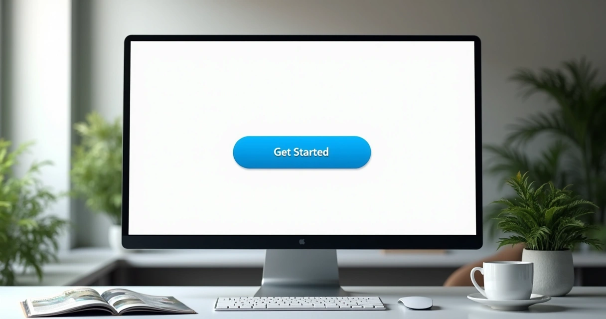
- Call to action: Make it clear how visitors can get started or learn more.
- Visual punch: Use imagery, not clutter, to show professionalism.
In practice, I help startups say more with less. One standout example is Stripe’s early homepage: "Payments for developers." It was clear, direct, and told startups what problem they solved—without noise. That lean focus remains part of every website I craft, including for my clients seeking high-impact, full-stack results.
Structuring your startup website: a step-by-step guide
A strong online presence has structure and flow. Each section should advance your story, answer questions, and remove objections.
Homepage: setting the tone
This page does heavy lifting. It should introduce not just your product, but your brand.
- Clear communication: Avoid jargon. Speak your customer’s language. A tech startup targeting non-technical founders must avoid acronyms; I always rewrite these for plain English.
- Visual hierarchy: Use larger fonts for key points. Place your CTA above the fold. Color and contrast matter—subtle but effective use of brand colors lets users glance and understand what to focus on.
You might want to see my extended thoughts about modernizing a professional website for more practical examples.
About section: building confidence
Early-stage startups often hide their team or backstory, but letting users know who’s behind the business increases credibility. A founder photo, short bios, and your mission statement can make a company feel trustworthy and relatable.
I encourage founders to add achievements, awards, or even a quick video introduction. Human touches always win over visitors—especially those unfamiliar with your name.
Product or services: clarity and benefits
List offerings with a keen focus on the customer’s pain points.
- Describe the solution, not features alone: Show what problems you fix, not just how your tool works.
- Use clear icons and visuals: They break up text and help scanning eyes grasp your strengths quickly.
In one project for a SaaS startup, grouping features under customer goals (“Save time,” “Collect better data,” “Protect your privacy”) led to much higher engagement compared with a simple feature list.
Social proof: trust in action
People believe people. Case studies, client logos, testimonials, and even numbers (“Over 5,000 users in 8 months”) build credibility.
If you’re just starting out and don’t have high-profile users, use detailed testimonials from beta users or industry connections. As an engineer, I help clients display verified reviews and integrate widgets like Trustpilot or Google reviews.
Team section: more than faces
Showing your team isn’t just about smiling photos. Add background on experience, skills, or successful projects—especially if you’re seeking investment or enterprise clients. People want to see you’re qualified and capable.
Contact and conversion: making it easy
No one wants to hunt for an email or phone number. Use clear, simple contact forms. Place calls to action (“Book a free consult,” “Request demo”) wherever a visitor might be ready to act.
As I recommend in my affordable website design for small business guide, every click towards contacting you should feel natural, not forced.
Legal and privacy: building trust by default
Make privacy policies, terms, and GDPR notices visible. This matters more as you grow, especially in SaaS or ecommerce. Modern site builders often include legal templates—never skip them.
Design choices that drive results
Great design connects, but it should never get in the way. Good design should feel invisible—but the results, you’ll notice. Below are steps and decisions that, in my work, have made all the difference for startups taking their first steps online.
Focus on responsive, mobile-first layouts
Today’s visitors are just as likely on a phone as a laptop. In my experience, new businesses often underestimate how many users start on mobile. A well-structured startup site adapts to every screen size, with buttons that are easy to tap and forms that resize perfectly.
I dig into these techniques further in my guide to responsive web design.

Fast load times mean more business
According to the U.S. Web Design System, almost half of users expect a website to load within two seconds and many abandon sites that take longer than three seconds, which means delays do more than annoy—they cost you money.
From content delivery networks (CDNs) to optimizing images and using caching, I always plan for speed. As a DevOps specialist, I streamline backend performance so growth doesn’t slow your site down.
If your site feels slow, you’re losing leads.
User experience is everything
You can’t afford confusion or friction. Every click should be intuitive. Here’s how I approach making it simple:
- Navigation menus with just enough options—no clutter
- Consistent button styles and colors
- Clear feedback after actions ("Message Sent!" or success popups)
After all, as I often tell founders, “The fastest way to prove your reliability is to give a smooth, frustration-free visit.”
Branding that works: practical strategies for startups
A brand isn’t just a logo. It’s a feeling you create in your audience. For fresh startups, branding often means balancing limited budgets with big ambitions.
Set up your visual identity from day one
Pick two or three main brand colors and stick with them. Choose a readable, unique font. Create a logo that reads well even at small sizes. For most startups, minimalism wins—think of how Dropbox started with clean blue-and-white visuals.
- Consistency over complexity: Stick to your palette and style everywhere—on the website, product, emails, and socials.
- Professional tools: If you’re not ready for a custom logo, use services like Canva or paid templates for a polished look until growth allows for custom design.
In my projects, I always align look and features with business goals. For AI-based startups, I skew towards tech-forward, crisp design. For B2B services, trustworthy blues and geometric typefaces always test well.
Use visual hierarchy for usability
Arrange elements so users know what’s important at a glance. Large headlines, bold calls to action, and consistent iconography guide the eye. Avoid overwhelming visitors with too much on one screen.
I’ve seen direct changes in conversion rates when moving “Get Started” buttons above the fold and using contrasting colors to highlight them. It’s small adjustments, but they matter a lot in the early days.
Social proof and calls to action: how startups win trust
Trust wins sales—whether that means an email signup or a demo request.
Building social proof that converts
Case studies, testimonials, user counts, and media mentions all feed into trust. Even a “Featured in TechCrunch” badge or customer story screenshot helps. For brand-new startups, beta tester feedback is golden—never overlook it just because it’s not from a big name.
- Use real names and photos for testimonials if possible
- Show recognizable logos of partners or clients
- Add metrics (“200+ teams trust us”)
Over time, swap in more impressive cases as your user base grows. As a freelancer, I often build testimonial widgets that let founders easily update and reorder their best social proof.
Compelling calls to action
If you don’t ask, you rarely get. Spell out what you want users to do—whether that’s “Book a call,” “Try free,” or “Download our white paper.” CTAs should be short, direct, and above the scroll where possible.
In my startup work, adding a sense of urgency (“Limited spots,” “Join next cohort”) often increases conversions right away. Every website I deliver for early-stage companies comes with a variety of CTA options—test them all!
Choosing the right tools, templates, and platforms
Selecting a web platform can feel overwhelming. There’s WordPress, Wix, Webflow, and others. Yet my experience shows that the best solution is the one tailored to your business goals, not just fancy features.
Your website builder choices
- WordPress: Flexible, lots of plugin choices, good for content-heavy or SEO-driven sites. I often build customized WordPress themes for founders who want to grow fast.
- Webflow: Clean for design-led startups. Great if you want more control over the visual layout without code.
- Custom (React, Next.js, Vue): Best for SaaS or AI products needing scale, integrations, or custom user journeys. With my background in PHP, JavaScript, and AWS, I build robust custom sites for companies needing more than basic “brochure” pages.
To dig deeper into affordable custom and template-based approaches, see my detailed advice on web development services for startups.
The role of templates versus tailored design
Pre-made templates let you launch fast and on budget, which can matter at the start. I often recommend templates for MVPs or landing pages. But as you gain traction, a custom site—matching your exact needs—offers flexibility and uniqueness.
If you work with me, I’ll guide you on whether a template or full custom design is better. No template should ever force you to sacrifice speed or usability.

Many website builders promise ease of use. I find founders benefit most by working with someone who can customize the platform as the startup’s needs change. Unlike some automated drag-and-drop builders, I bring deep technical and design expertise, speeding up launches and future updates without headaches.
SEO basics tailored for startups
A website that can’t be found will never grow your business. While startups don’t need advanced SEO tricks from day one, some basics make a big difference.
- Keyword research: Find out what your audience searches for. Use simple tools like Google Keyword Planner for ideas.
- Well-structured content: Use headlines (H1, H2, H3) reflecting your main topics. Keep sentences short and clear.
- Optimize images and metadata: Compress images for speed; write natural alt text, like I’ve shown above.
- Internal linking: Guide users from one page to another with helpful links—this also boosts your search rankings.
- Mobile-friendliness matters for Google rankings: I share more approaches for this in my guide to mobile-friendly web design.
If you want your website to actually generate leads, not just exist online, I build in these features from day one. For B2B and SaaS sites, I customize meta tags and structured data—giving you an edge that “DIY” solutions miss.
Aligning your website with business goals
Your website isn’t a business card; it’s a living tool. My most successful clients come with clear growth goals. Whether you want more demos, higher signups, or easier sales, structure your website to drive those outcomes.
I start each project by discussing your sales funnel. Do you need to educate new users before selling? Is a self-serve sign-up best, or is your solution complex enough to justify a consultative booking flow? Every site section should reflect these decisions.
Sometimes that means integrating chatbots or connecting with CRM tools. Other times, it’s about refining the FAQ or adding conversion-focused case studies. Everything comes back to what your business needs for the next stage of growth.
Measuring success and iterating forward
Launch is only the beginning. As Ohio University guidance confirms, reviewing engagement and conversions helps you improve over time. I always install analytics tools—Google Analytics or privacy-focused Matomo—and set up dashboards for each client.
- Track where users drop off, and fix friction points
- Use heatmaps to see which buttons or sections engage users
- Split-test headlines and CTA text for higher conversions
The real secret? Make small improvements every month. Over a year, those changes add up to industry-leading conversion rates and an online reputation competitors envy.
Why my freelance services are the best fit for founders
You have hundreds of options for web development support—from big agencies to template libraries. But what sets my services apart is the blend of technical depth, agility, and personal partnership you won’t find everywhere.
As highlighted by DeVry University, the demand for experienced developers is soaring, and not just for coding, but for understanding business and innovation. Since 2007, I've helped startups in SaaS, retail, AI, and more guide their first impression, wow investors, and drive actual sales—not just web traffic.
- Personalized, end-to-end service: I dig into your business model, goals, and user base before writing any code or design.
- Full-stack skills, modern solutions: From PHP to JavaScript and AWS, I support everything from MVP to scale.
- Speed with polish: Fast launches, but always clean, well-tested code and best-practice security.
- Growth in mind: Every website is built to scale, not just look pretty. Updates, new features, and SEO—it’s all included.
- A partner, not a vendor: My clients know they can reach out for support, tweaks, or strategic advice any time. Your business matters to me.
My clients often tell me how much easier their launch felt because they weren’t just handed a template—they had a real partner. If you want your startup’s online presence to be effortless, persuasive, and ready for the next big thing, let’s talk.
Conclusion: your first step to a truly professional web presence
Building a convincing, effective website for your startup isn’t just about design. It’s about sending the right signals to users, reflecting your brand values, and moving visitors closer to action.
From first impression to final conversion, every detail counts. With a tailored approach—balancing speed, structure, social proof, and growth—a web presence becomes your strongest launch tool. I invite you to contact me at Adriano Junior and discover how personal, expert web development can transform your startup’s future.
Frequently asked questions
What makes a website professional for startups?
A startup website is most convincing when it’s fast, mobile-friendly, communicates value clearly, and builds trust with visitors through social proof and expert branding. Professional sites also guide users to take targeted actions, such as signing up, booking a call, or learning more, without confusion or wasted steps. In my view, it’s the mix of design polish, technology reliability, and strong messaging that sets the best sites apart.
How much does it cost to build one?
The cost varies depending on needs and ambition. A basic, template-driven site might start around a few hundred dollars, while a fully custom, feature-rich launch can range into several thousand. My freelance services are designed to keep costs predictable—offering affordable starts for MVPs and clear quotes for growing needs. For comparison, agency rates or platforms with hidden fees often become more expensive overall, while my clients get transparency and ongoing partnership.
What are the key steps to start?
Start by setting clear business goals, then outline your website’s structure—homepage, product, team, social proof, and contact sections. Choose a visual style and platform based on your growth plans, get your core messaging right, and collect authentic social proof. Work with an experienced developer to ensure site speed, mobile-friendliness, security, and analytics are ready for launch. Test with real users and improve based on analytics.
Which platform is best for startups?
There’s no single answer, as the “best” platform matches your technical needs and growth plans. WordPress is great for content-focused sites with plugin flexibility; Webflow suits design-driven brands wanting more control; while custom builds using React or Next.js offer unmatched flexibility for SaaS or AI projects. As a freelancer, I help clients decide by matching the platform’s advantages to their goals, future-proofing each step.
Is it worth hiring a web designer?
Hiring a web designer or developer saves you time, helps you avoid mistakes, and makes a stronger first impression—critical for early-stage startups competing for trust and attention. DIY builders are fine for landing pages or idea tests, but to win sales or investor interest, expert guidance in branding, structure, and technical reliability makes all the difference. My freelance clients often say the investment paid off within weeks through higher signups and improved credibility.